

Table of Contents
- What is website navigation?
- Why is website navigation important?
- Best website navigation examples to inspire your design
- 1. Terra Outdoor
- 2. Patagonia
- 3. Nike
- 4. Rapha
- 5. Mercedes-Benz
- 6. What Is Missing
- 7. Cartier Time Project
- 8. Drunk Elephant
- Website navigation menu best practices
- Different types of website navigation
- Ready to design your website navigation?
- What are the best website navigation examples that are proven to drive conversions? WebFX highlights navigation examples like Terra Outdoor’s drop-down menus, Patagonia’s intuitive hierarchy, Nike’s minimalist mega menu, Rapha’s breadcrumb navigation, and Drunk Elephant’s mobile-friendly hamburger menu—all proven to make browsing effortless and guide users toward conversion.
- What is website navigation? Website navigation refers to guiding users through a website using features like layout, design, graphics, icons, text, menus, and buttons that help visitors access and move through different pages, products, and services efficiently.
- Why does website navigation matter for business success? Effective navigation streamlines user experience, improves average time on site, decreases bounce rate, and demonstrates that you’re a helpful brand — ultimately encouraging visitors to purchase your products or services when they’re ready.
- What are the most common types of navigation menus? The five main navigation types include header horizontal navigation bars, vertical sidebars, drop-down menus for multiple content categories, hamburger menus that save space on mobile devices, and footer navigation menus offering broader content options.
- What design principles create effective website navigation? Best practices include drawing user attention with contrasting colors and bold CTAs, optimizing for all screen sizes with responsive design, using minimal menu items to avoid overwhelming visitors, and leveraging data from tools like Google Analytics to improve navigation based on actual user behavior.
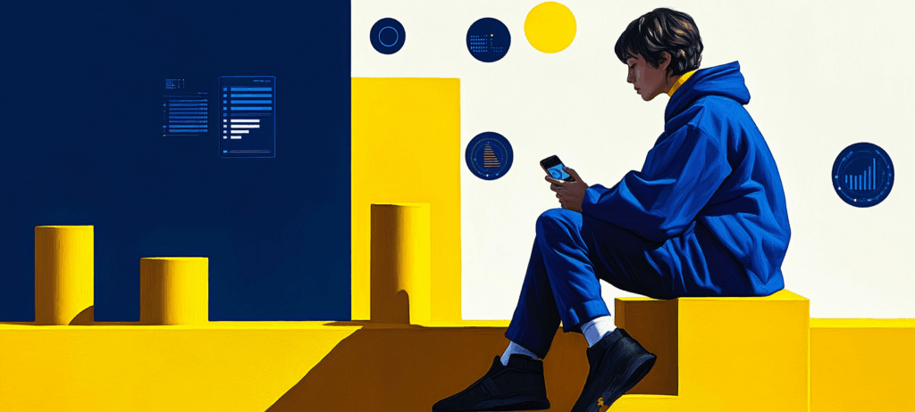
Your website’s navigation plays a key role in shaping a smooth, enjoyable user journey. The best website navigation examples highlight how clear menus, logical page paths, and consistent layouts help visitors find what they need and take action with ease.
Explore how top brands design seamless, user-friendly experiences through these website navigation examples, and learn practical ways to create effective navigation for your own site:
- What is website navigation?
- Why is website navigation important?
- Website navigation examples to inspire your design
- Website navigation menu best practices
- Different types of website navigation
Watch Now: How to Do Accessible Web Design
What is website navigation?
Website navigation refers to guiding users through a website with features like:
- Layout
- Design
- Graphics
- Icons
- Text
- Menu
- Buttons
These characteristics help users access and move through different pages, products, and services. For example, a top navigation menu has icons or text displaying the website’s primary products and services.
With visible icons, users can navigate to a specific page and find what they’re looking for.
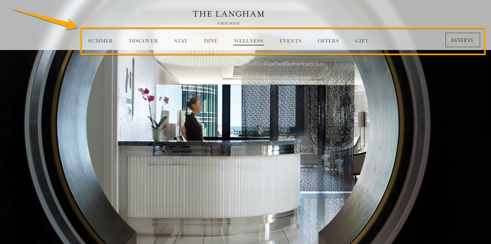
Why is website navigation important?
Website navigation is crucial because it streamlines the user experience. As a result, your site visitors can easily find what they’re looking for and visit relevant pages that satisfy their needs.
When your site visitors have a pleasant experience on your site, it improves your average time on site and decreases bounce rate. The biggest benefit of a streamlined user experience is it shows site visitors that you’re a helpful brand and they may turn to you when they need to purchase your product or services.
8 of the best website navigation examples to inspire your design
We rounded up the best website navigation examples from top brands! Find out the best practices that make their navigation structure effective.
Website navigation examples
- Terra Outdoor for its drop-down navigation
- Patagonia for its intuitive hierarchy and consistent placement
- Nike for a minimalist yet easy-to-find drop-down menu
- Rapha for its breadcrumb navigation
- Mercedes-Benz for its visual drop-down menu
- What Is Missing for an engaging navigation and hover effect
- Cartier Time Project for its hover top navigation menu
- Drunk Elephant for its execution of a hamburger menu
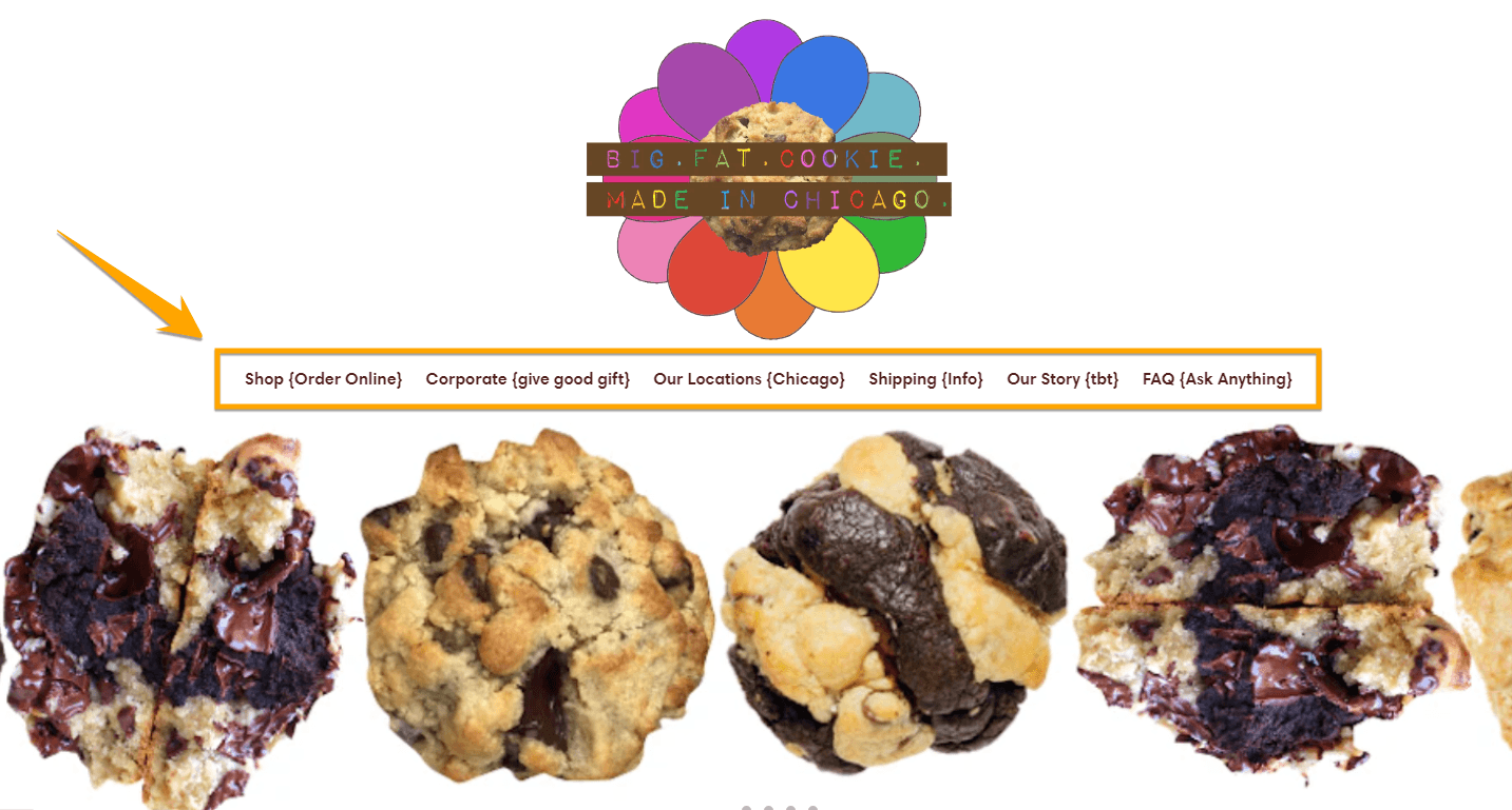
1. Terra Outdoor: Drop-down navigation for easy catalogue browsing
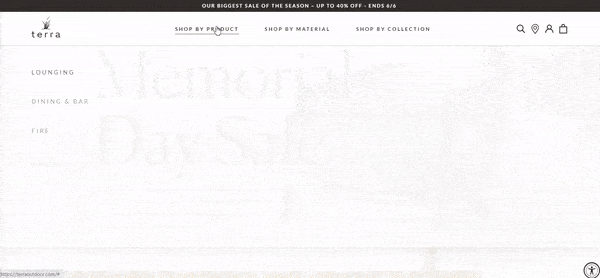
Terra Outdoor’s website uses a drop-down navigation menu that makes it easy for users to browse the listings.
The items are sorted according to product groups, materials, and collections in the navigation bar. Then, as a user clicks on a category, the products are sorted according to subcategories.
Site visitors can use filters so they can easily find what they’re looking for.
2. Patagonia: Intuitive hierarchy and consistent placement
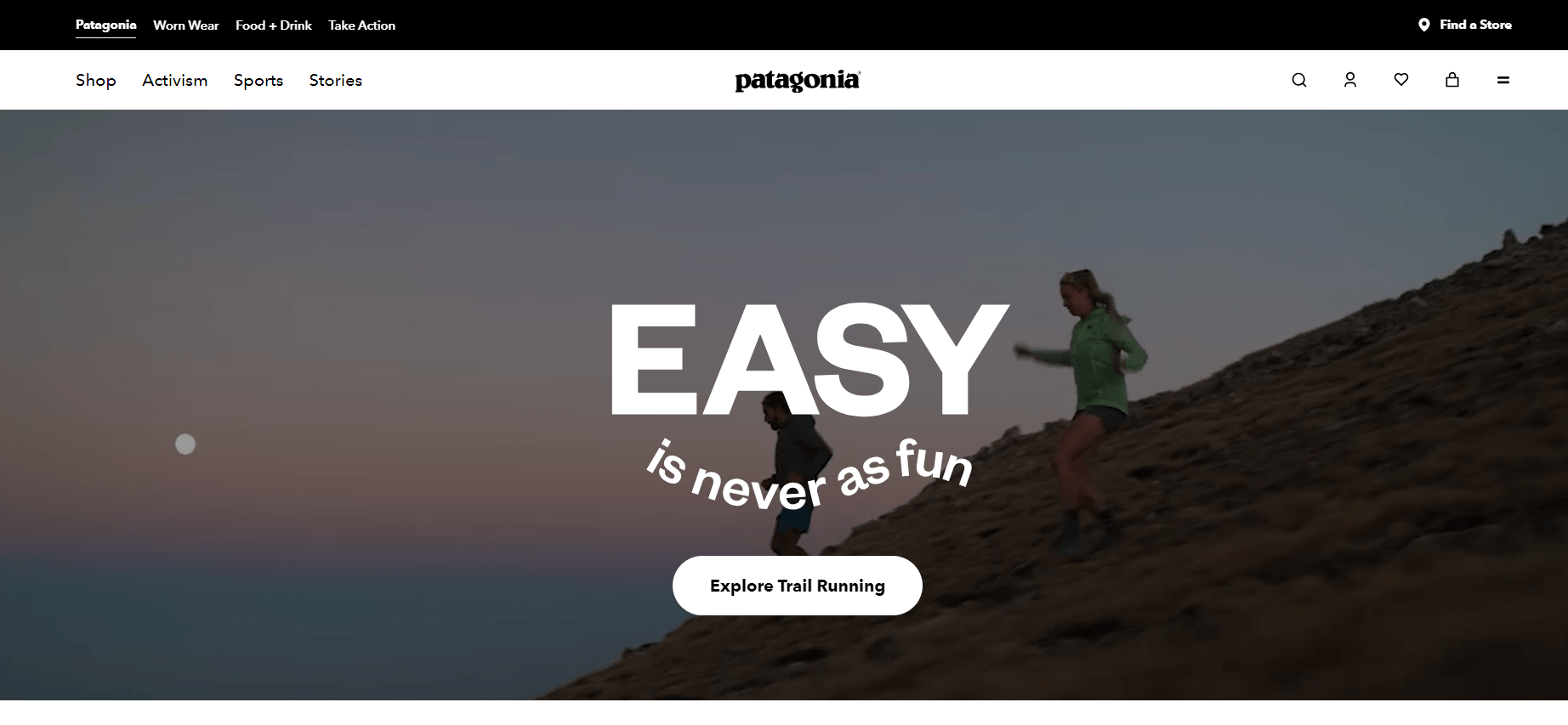
Patagonia’s web design prioritizes intuitive hierarchy and consistent placement. It has a hamburger menu that provides links to other important sections that a site visitor may find useful, such as their customer services, career, and press pages.
While the brand has products for several audiences, browsing the website is a breeze because the products are logically arranged per audience segment.
3. Nike: Minimalist yet easy-to-find drop-down menu
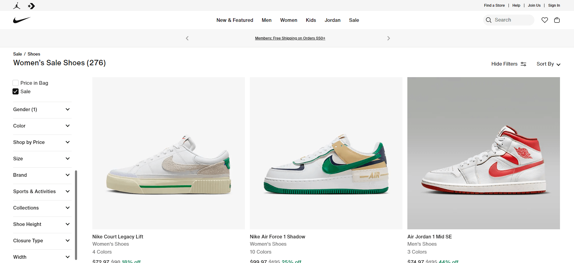
Nike uses a clean, white, minimalist background, amplifying product graphics on the homepage.
The drop-down navigation menu helps users find the products they’re interested in. If they want to shop for other products from another category, they can go to the top center mega menu to view other products from other categories.
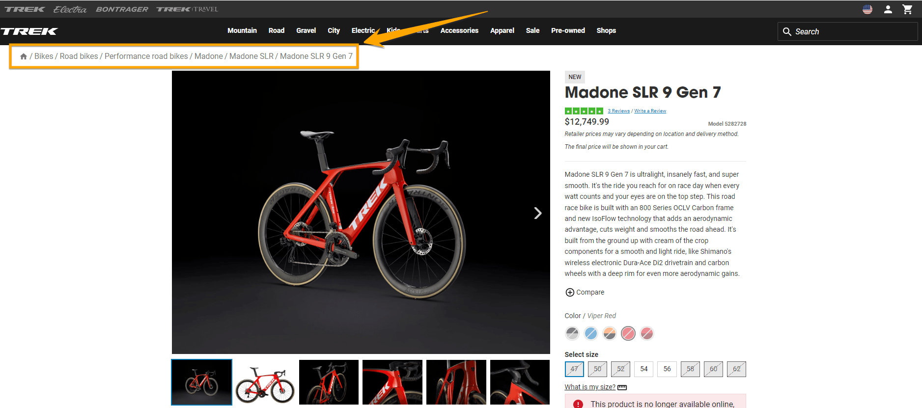
4. Rapha: Breadcrumb navigation
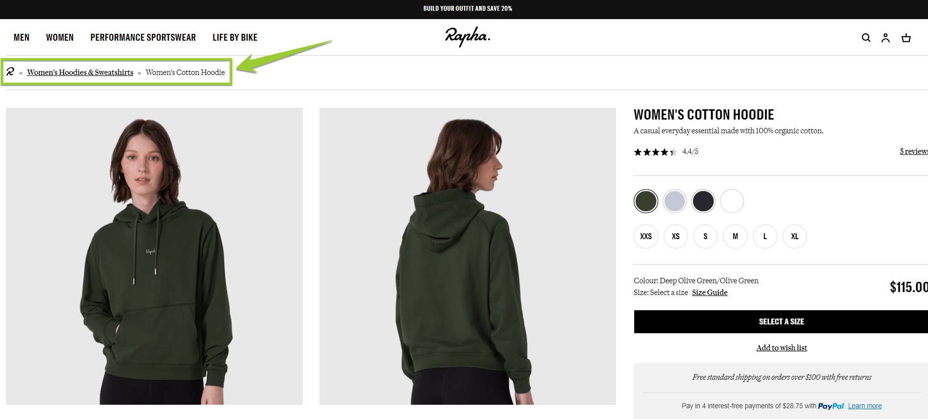
Rapha’s layout structures product collections strategically, leading users through the main categories. The big and bold visuals accentuate the clear and concise white hyperlinked headings, leading users to shop now and browse sales.
Its design offers a visible search function and a prominent navigation menu on the top right of the screen. If you want to go back to a category page, you can use the breadcrumb navigation at the top.
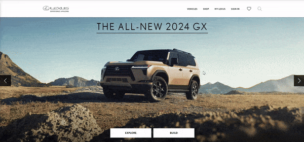
5. Mercedes-Benz: Visual drop-down menu
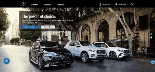
Mercedes-Benz uses a visual drop-down menu to help users explore different car models. The website design has a search function, and menu tabs are accessible with a keyboard and mouse. The design is subtle, highlighting the main features.
It has a detailed footer menu with clear and concise text.
6. What Is Missing: Engaging navigation and hover effect

What Is Missing offers multiple visual cues like hover effects. Users can navigate between tabs or icons and zoom in and out. The black background enhances the white text and colorful graphics.
The menu spans the whole page. The category options are visible, and users can click on the hamburger menu to return to the start. The website is responsive and has quick load times.
7. Cartier Time Project: Hover top navigation menu
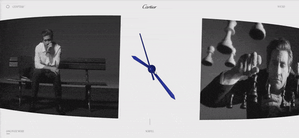
Cartier’s Time Project page is responsive, concise, and accessible. Users can toggle through products and return to the homepage using the hover top navigation menu. The minimalist video background uses little text, color, and movement.
The enter button directs users to multiple video shorts where they can select and skip video chapters with their keyboard.
8. Drunk Elephant: Hamburger menu execution
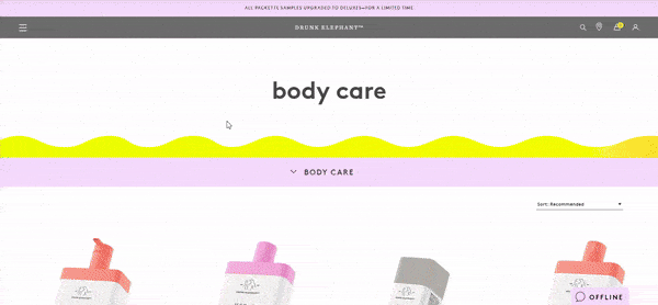
This beauty brand effectively uses a hamburger navigation menu to guide users on their journey on the site.
Clicking the hamburger menu displays the product categories, while hovering over a category shows the product images with details like review ratings and product names. When you click on a product, you are led to the product page.
You can access the main navigation menu through the hamburger menu anywhere you are on the site, making it easy to go back to a category page or any other page on the site.
5 website navigation menu best practices
Inspired to emulate the website navigation examples above? Here are five best practices for designing your site’s navigation:
- Draw user attention
- Optimize your layout design for all screens
- Guide users through your web pages
- Use a less-is-more approach with menu items
- Focus on data-driven design
Let’s go through each one:
1. Draw user attention
When users land on your website, they have a purpose in mind. It could be any of the following:
- Search for information on a product or service
- Browse items and services
- Learn about your company
- Purchase an item
- Leave a review
- Contact you
Helping users find what they need quickly is essential for a great user experience. Drawing their attention to menus and text is one of the best ways to help them achieve their objective quickly and effortlessly.
You can make navigation menus a different color from the background to make them readable. You can also let it blend with your site’s overall look and make it appear when a user scrolls up or clicks the top portion of the page.
Next, highlight essential information so that it is eye-catching. Use bold, clickable buttons for cues, like leave a review or shop now.
2. Optimize your layout design for all screens
Fun fact: 54% of all website traffic is generated from mobile phones.
That said, it’s crucial to have a responsive website design, so that your site elements — including your navigation bar — will display properly on any screen.
Your site visitors want a seamless experience when accessing your website. If they want to check out your products, it must be easy to navigate your site and go from one page to the next, even on small screens.
Slow load speed, text that gets cut off, and incompatible screen resolution can affect user experience. Adjusting your website layout for tablets, computers, and other platforms enhances your website navigation and usability. You can get inspo from these UX design examples.
3. Guide users through your web pages with breadcrumb navigation
People might click on multiple tabs while browsing your website. For example, a user clicks on a category, a subcategory, a product, product information, or related products. In minutes, they’ve forgotten where they began and what they were looking for.
You can use smart navigation techniques to help users return to their initial search or starting point. Breadcrumb navigation helps users identify where they are on your website and helps them get back to the start. It can also make browsing your site convenient and satisfying.
4. Use a less-is-more approach with menu items
If you’ve ever ordered food off a complex restaurant menu, you know how overwhelming it can be. It’s the same with website menus.
Looking for specific items on a lengthy nav menu can feel overstimulating. Users might get despondent and bounce off your website.
Consider a minimalist approach to navigation menus. Add menu options strategically and sparsely to help users instantly spot what they’re looking for.
For example, instead of adding all your service options in one menu, create separate category menus on your top navigation with fewer options under each title.
5. Focus on data-driven design
One of the best ways to improve your website navigation for your audience is by using user activity data to improve your website design and layout.
With tools like Google Analytics and heat maps, you can track and identify a user’s browsing patterns and journeys. Heat maps help you identify pages and tabs that users navigate first and frequently.
Use tracking data to optimize your webpage design and make it more accessible and convenient for users. For example, if your About page gets the most attention, you can move the About Us tab to the top of your menu or the first option in your top navigation, making it more visible and easily accessible.
5 different types of website navigation
Here are the common types of website navigation design:
- Header horizontal navigation bar
- Vertical sidebar
- Drop-down navigation menu
- Hamburger menu
- Footer navigation menu
Let’s discuss each one:
1. Header horizontal navigation bar
The horizontal navigation bar is one of the most common navbar examples. It displays website pages or categories horizontally in the top header. The page name appears next to each, often including titles like the following:
- About Us
- Sign Up
- Contact Us
The horizontal navigation bar highlights the primary or popular website pages, helping users spot them quickly.
2. Vertical sidebar
A vertical sidebar navigation menu is often on the left-hand of a webpage. They give websites more space to list their content options vertically.
While vertical sidebar navigation can work for various sites, it is most suitable for websites with a high number of navigation links. Other design types can be ideal for websites with fewer links.
3. Drop-down navigation menu
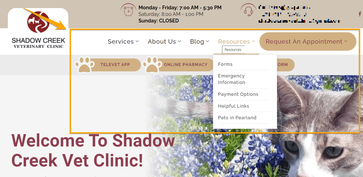
The drop-down navigation menu expands from the top of the page, displaying website information and product and service options. Users can hover over drop-down navigation menus and fully view the items under a specific website page or category. Drop-down navigation menus are excellent for websites with multiple pages and content pillars.
4. Hamburger menu
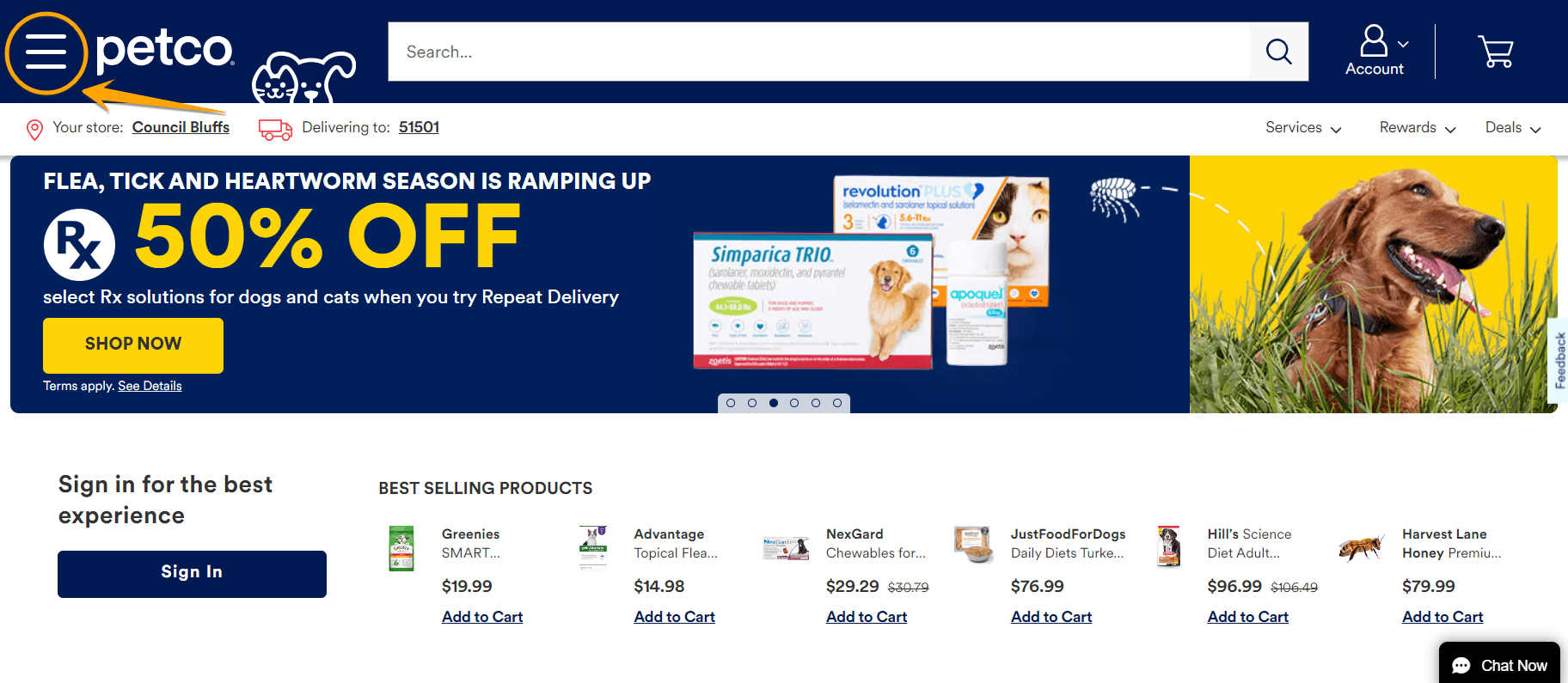
A hamburger menu lists page content vertically on a mobile device and horizontally on a computer.
When a user clicks on the three-line hamburger icon, often at the top of a page, a drop-down menu displays a content list. Content headings can have arrows leading to subcategories.
Hamburger nav menus are great for condensing content and saving space.
5. Footer navigation menu
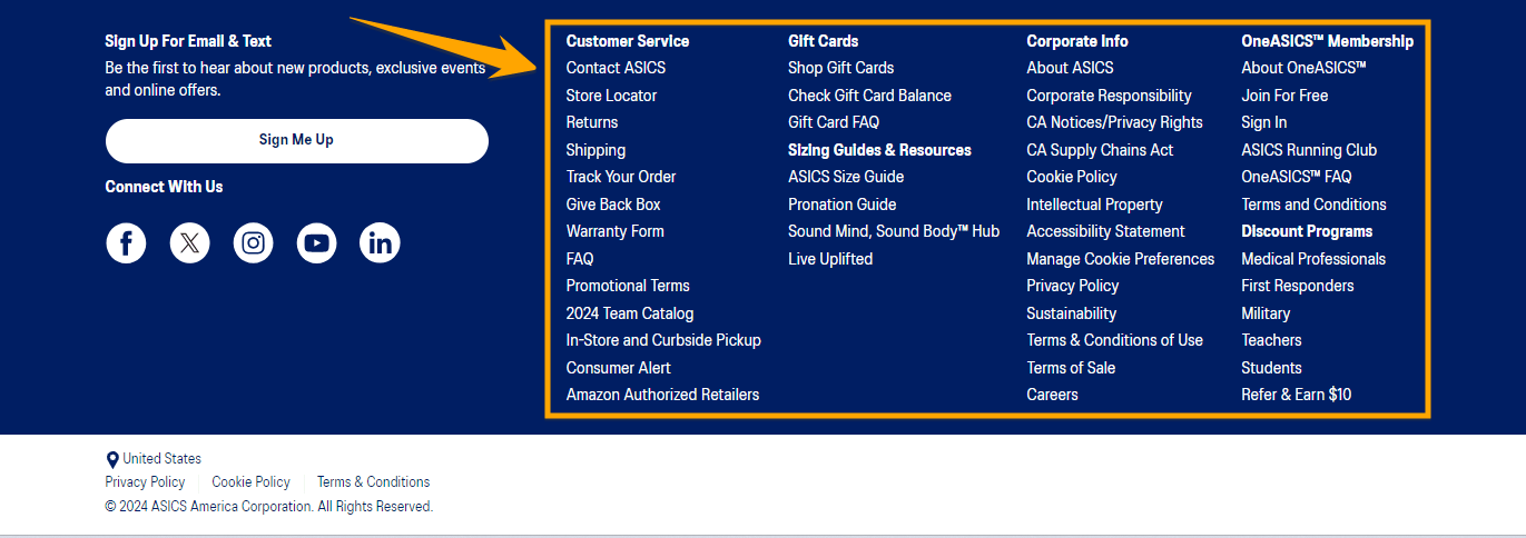
A footer navigation menu is a common navigation menu example. It is the menu at the bottom of a website. The footer navigation menu often offers a broader selection of content options. It’s an excellent way for users to find and navigate to different pages without scrolling back to the top.
We’ll help you create a website that stands out.
“WebFX has been instrumental in helping us develop a new website, allowing us to be a leader in our industry.”


Ready to design your website navigation?
Excellent website navigation is key to improving user experience, which leads to conversions and revenue growth. If you want to improve your website navigation, consider teaming up with us to improve your conversion rate and maximize return on investment.
WebFX is a full-service digital marketing agency and a leading Atlanta web design agency. We understand the importance of creating a website that benefits users and your business.
We use data-driven digital marketing to design and optimize your website navigation to drive results and grow your bottom line. Our designers are experts in their field and have extensive knowledge in creating responsive, accessible, and user-friendly website design and layout.
Contact us online or call us at 888-601-5359 to speak with a strategist about our website design services and creating a winning website!
-
 Macy Storm is a Content Marketing Consultant at WebFX. She has 5+ years of experience creating content for all digital strategies and across 10+ industries. With a B.A. in Communications, she’s used her writing skills to write over 1,000+ pages for WebFX and SEO.com. Her work has been featured by Search Engine Journal, HubSpot, Entrepreneur, Clutch, and more. When she’s not clacking her keys, she’s playing video games, reading, or counting how many times people say her puppy Daisy is cute (it’s a lot of times).
 -

WebFX is a full-service marketing agency with 1,100+ client reviews and a 4.9-star rating on Clutch! Find out how our expert team and revenue-accelerating tech can drive results for you! Learn more
Make estimating web design costs easy
Website design costs can be tricky to nail down. Get an instant estimate for a custom web design with our free website design cost calculator!
Try Our Free Web Design Cost Calculator
Table of Contents
- What is website navigation?
- Why is website navigation important?
- Best website navigation examples to inspire your design
- 1. Terra Outdoor
- 2. Patagonia
- 3. Nike
- 4. Rapha
- 5. Mercedes-Benz
- 6. What Is Missing
- 7. Cartier Time Project
- 8. Drunk Elephant
- Website navigation menu best practices
- Different types of website navigation
- Ready to design your website navigation?
Share this article


Web Design Calculator
Use our free tool to get a free, instant quote in under 60 seconds.
View Web Design Calculator
Make estimating web design costs easy
Website design costs can be tricky to nail down. Get an instant estimate for a custom web design with our free website design cost calculator!
Try Our Free Web Design Cost Calculator