
It can feel nice to load up your website with fancy backgrounds, shiny buttons, and dynamic cursors. All that extra noise, however, can slow down the load time, leading to a negative user experience.
Instead of having excess bells and whistles, why not try something simpler? Minimalist web design examples shine the spotlight on purpose. Visitors can pay attention to your product, service, or portfolio instead of the visual aspects.
Below, get inspiration for your site’s next redesign and answers related to minimalist web design principles!
25 minimalist website designs that show you that less is more
Before rushing off to start on your own minimalistic website, take some time to look through the following simple website examples to use for inspiration:
1. McChill
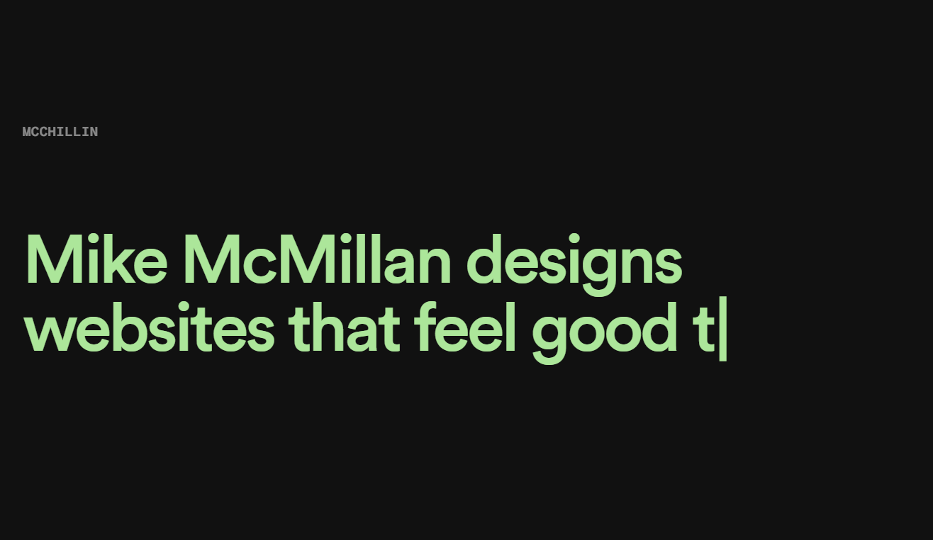
Mike McMillan makes it easy to check out his portfolio with a clean-feeling design. A solid background with animated text helps visitors learn about the website owner, services, and past achievements.
The large navigation links are easy on the eyes and take you directly to the projects. The page also has enough white space, making the content easy to read.
2. La La Land Kind Cafe
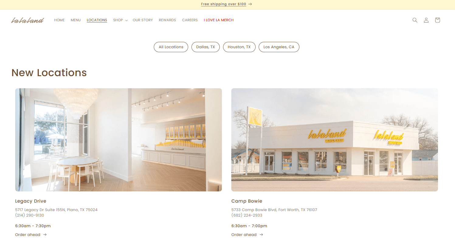
La La Land Kind Cafe uses a monochromatic color palette and high-quality images that suit the brand’s overall color schemes, proof that minimalist doesn’t have to be boring!
Ample white space makes it easy to read the page content. In addition, the site’s clever use of typography leads you to read the most important parts of the page.
3. Zero
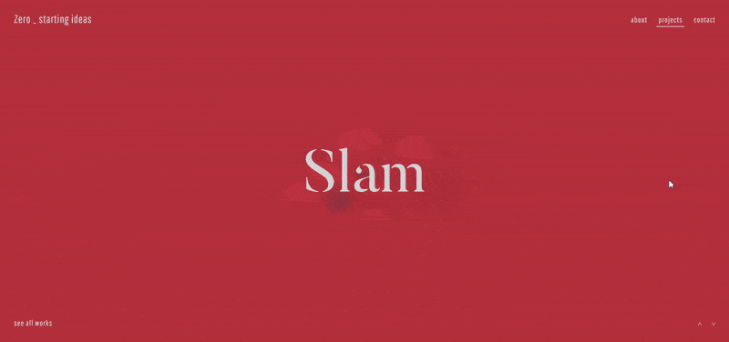
Zero is the epitome of simple and minimal. A screen-sized animation introduces the company services, followed by a mantra and a record of past completed projects.
You can see all their projects by clicking on a link, which opens them up in the center. With a limited color palette, simple typography, and just enough white space, this website is a clean and appealing one!
4. Mogutable
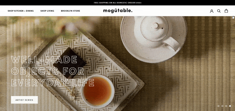
Another excellent minimalist web design example is Mogutable. Its website presents its wares with a grid that emphasizes photos.
The ecommerce website exudes luxury with its selection of light colors that complement its residential appeal. Shoppers can access their accounts and carts from the simple icons.
Mogutable’s simple web design uses enough white space, too. Each product page has the necessary high-quality images to show their offering.
5. Velvethammer
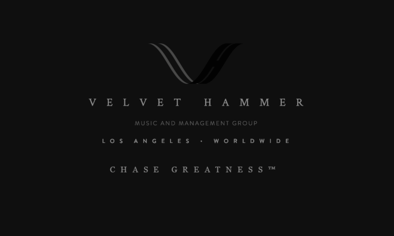
Velvet Hammer speaks to musicians in need of management services. A choice of solid colors paired with an elegant font sets the stage for professionalism with this brand.
Their homepage uses text blocks, making the content easy to read. It’s a portfolio website with a list of clients, showcasing how you can achieve success with a few words.
6. Oishii
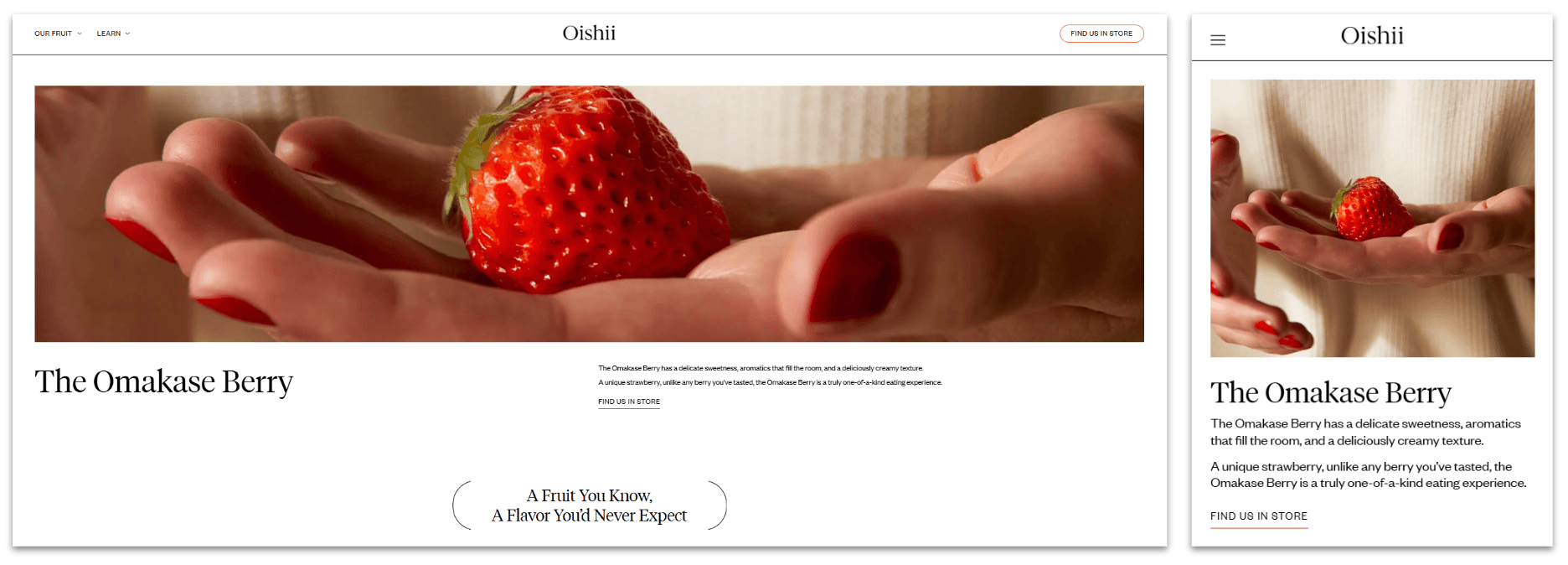
Oishii offers a special selection of berries in its product line. Its website focuses on pleasant images of these fruits, offering tidbits of information that pique your curiosity.
In addition, Oishii’s website has enough white space, making it easy to read their copy. Using different font styles and sizes, this minimal website design example guides site visitors to read the most important part of the copy. As a result, it also has a clear visual hierarchy.
You can easily find a store that sells these always-in-season plants through their store locator page.
7. Brooklyn Candle Studio
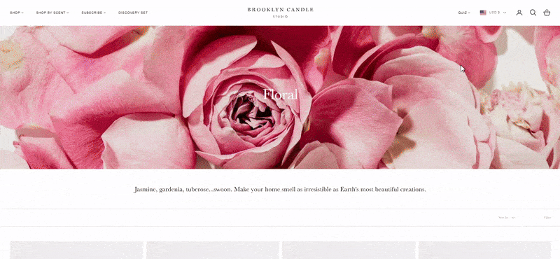
Brooklyn Candle Studio is an example of a minimalist website design that effectively uses white space. Clean and readable, its typography complements the high-quality images.
The site also features lazy loading, which delays the load of other elements, letting users focus on essential content.
8. TrueHarvest Farms

TrueHarvest Farms looks simple, but this site packs a punch when it comes to functionality.
The dark color scheme allows saturated colors to shine through upon hovering over the images. The menu button opens up several links that fill up the entire page.
It uses quality images that stand out against the black background.
9. Ramotion

Ramotion brings simplicity to the foreground with its website design. The large font on a white background makes it easy for readers to understand their message.
The navigation bar contains select pages that users may want to visit without cluttering the area. This minimal web design example uses various font weights and sizes, guiding users to which parts to read first.
10. Kirkland & Ellis

Kirkland & Ellis is an excellent example of a clever, uncluttered layout of a business website. Users can navigate the site through the hamburger menu.
Despite the variety of sections and content pages, the website manages to show only the necessary elements and with enough negative space. As a result, its content is readable and navigating the site is a breeze.
11. ET Studio
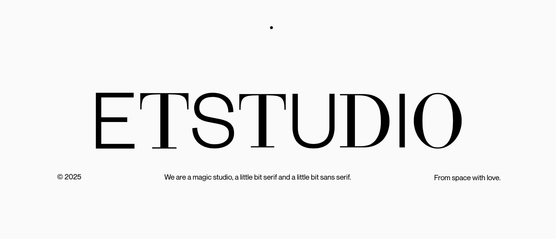
ET Studio takes the cake in the minimal category with its version of a portfolio website.
The first things you see on the landing page are large letters atop a white background, with nothing but page links. From this point, you can choose to visit one of the few available pages via the navigation bar.
The website uses high-quality images and enough white spaces, making it one of the best minimalist website design examples.
12. Monograph
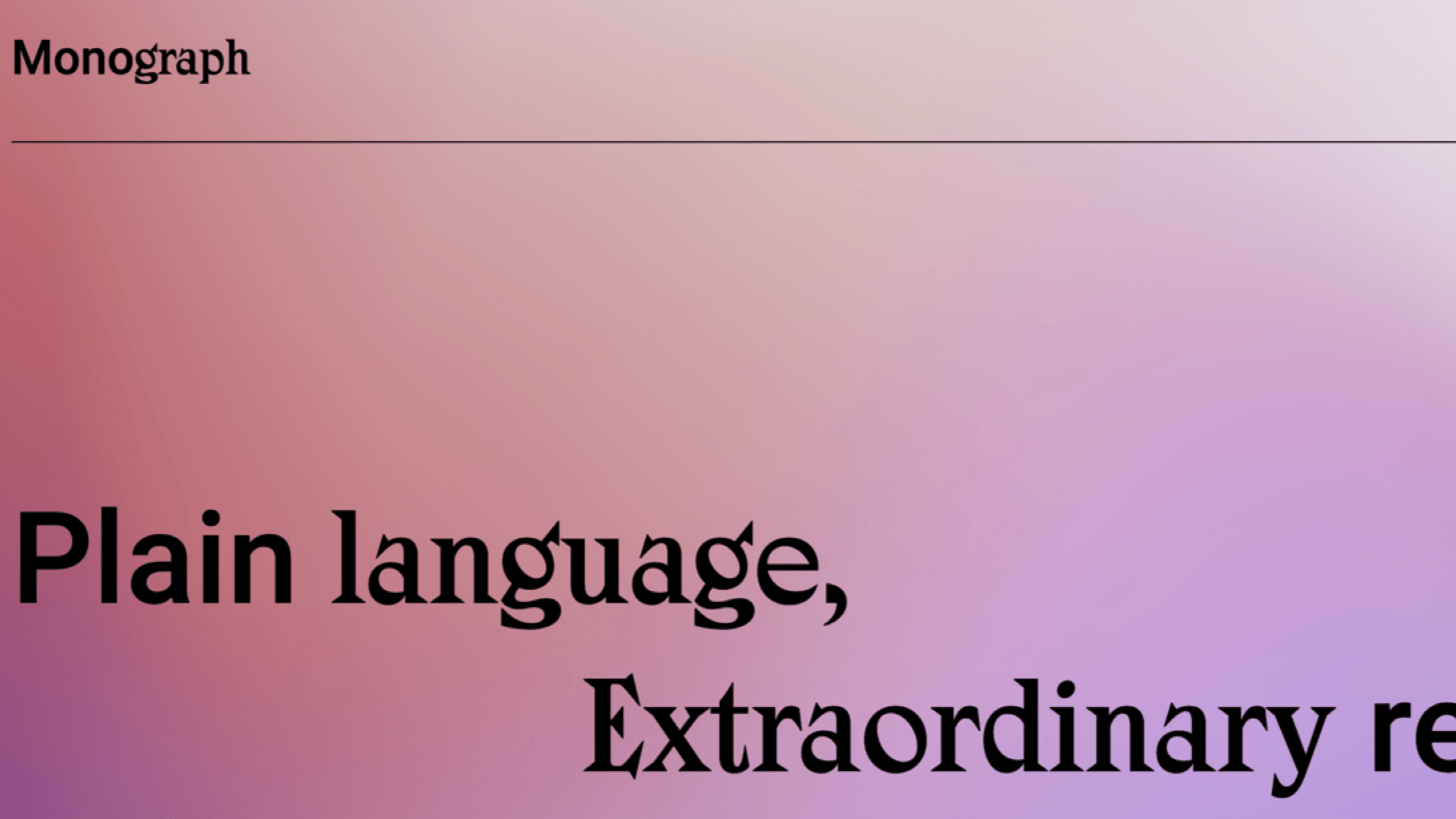
Monograph offers writing services on its elegant website. The web designer makes it easy to notice the purpose of the website with minimal chaos.
A color gradient draws the eyes toward the different areas of expertise. The menu is squared away on a neat little button that opens a larger version when clicked.
It uses typography to highlight certain words and messages, making it one of our best minimalist web design examples.
13. Maibec

Maibec serves the construction industry with its aluminum and cellular PVC products. Their website presents information in a high-quality, minimal fashion and places key images atop dark colors.
Users can easily find aluminum panels, PVC planks, and more by scrolling on the main page. Dizal’s website also uses simple color schemes and a consistent color for its call-to-action (CTA) buttons.
14. Aesop
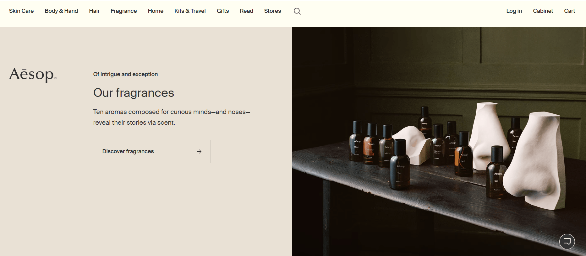
Aesop’s website uses a neutral color palette that complements the stunning images on its website. The simple layout and clever use of empty space draw users to the images and copy.
Its typography and visual hierarchy improve the site’s overall user interface and make it easy to browse. The site also employs lazy loading, making it easy for users to focus on key site elements as they scroll.
15. Studio Rotate

Studio Rotate uses images to capture the attention of users in an exciting manner. As you scroll, the images move in different directions and pause in place in anticipation of your clicks. Each link will take you to an ecommerce website project that has made a paying client happy.
The website uses a dark background that draws the user’s attention to the quality images.
16. Pocket Knife
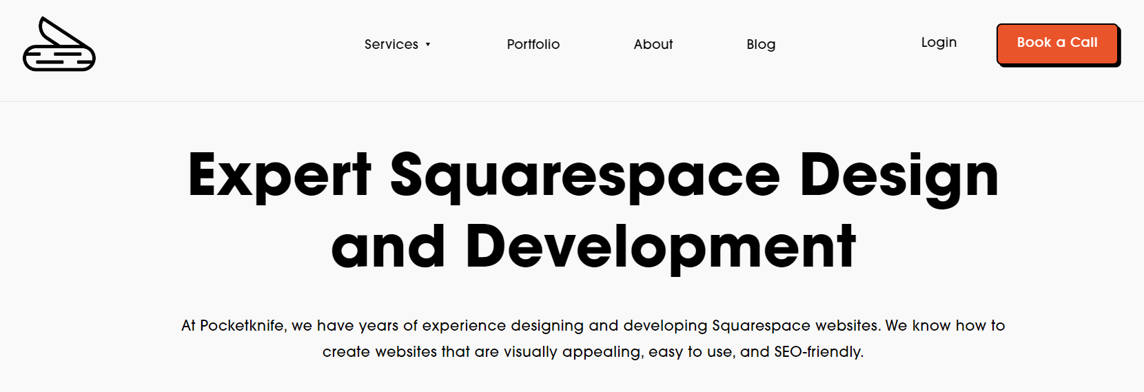
Pocket Knife design agency focuses on the Squarespace platform. A black background with a white font expresses their expertise neatly and calmly.
This company cuts right to the chase with a bare-bones approach to website design. Using only white and gray backgrounds, the website uses a striking orange color for its CTAs, which are impossible to miss.
17. Good Books
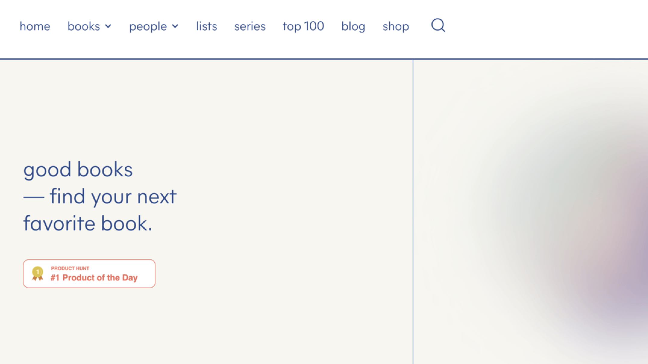
Good Books presents popular titles in a straightforward interface. You can find book recommendations and highlights sprinkled in between quotes.
The website uses a grid-based layout and has intuitive navigation. Its consistent color palette across pages gives it a clean, minimal aesthetic. In its product pages, white space surrounds the book covers.
This website is an excellent example of functional, minimalistic design paired with precision marketing.
18. Ignant
Ignant makes things simple with a white background and detailed photos. This production company lets their work do the talking as they take visitors for a ride through their extensive portfolio.
This website employs clever typography and white space, making the site easy to read, browse, and use. As a result, it puts the spotlight on the high-quality images.
19. Coursera

For a large website like Coursera, employing a minimalist web design can be a challenge. It involves balancing huge amounts of content with a simple layout.
Despite this challenge, the online course provider’s website features minimalist design elements such as ample space between text elements, readable fonts, and text hierarchy.
This website example features a grid layout. Using only blue as the main brand color and a few accent colors, Coursera achieves a clean look with clear CTAs.
20. Tous Le Jours

Tous Les Jours is another example of minimal web design. Each image that went onto the site is carefully selected. The color palette is consistent across its pages.
Each text block is easy to read, thanks to the ample empty space surrounding them. Minimalist illustrations support certain parts of the content, making them easier to digest.
21. Symbolset
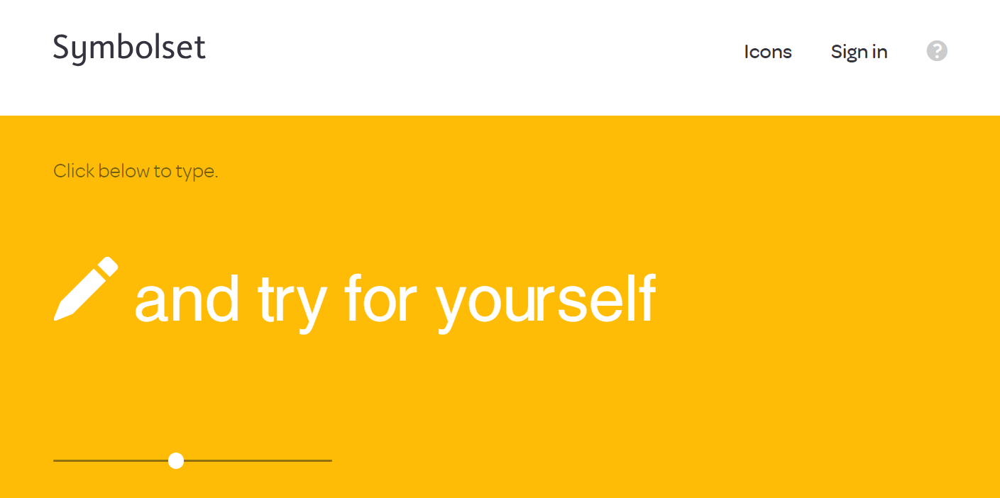
Symbolset allows users to convert typed text into symbols and icons. This website is another excellent example of a minimalist website design.
The site has enough white space to let users’ attention focus on certain elements of the page. Its typography emphasizes key messages like the number of keywords and symbols.
22. Andluca
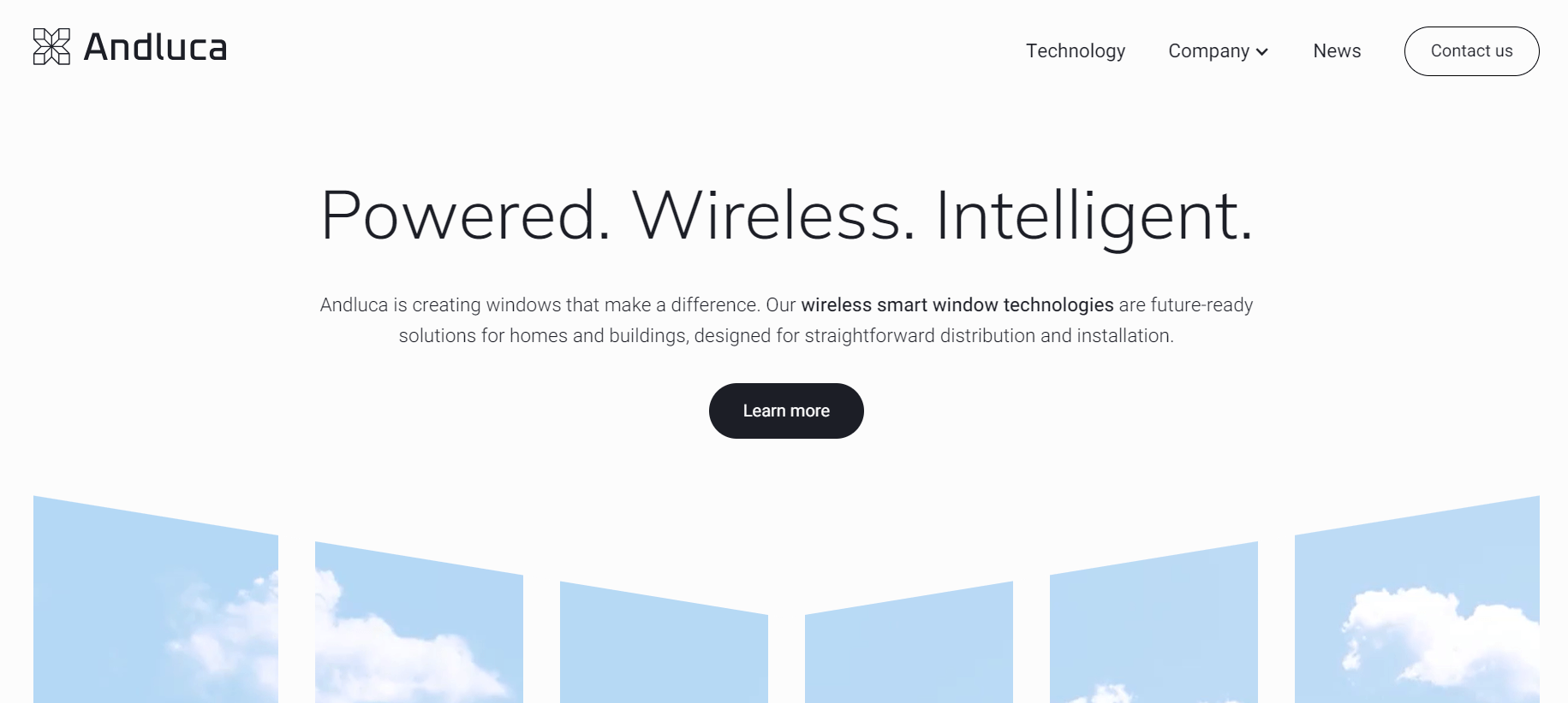
Andluca focuses on smart window technologies and keeps its website in compact condition. A strong, white background contrasts perfectly with the black typography, allowing users to spend more time on the information without becoming distracted by extra elements.
This minimalist web design example draws attention to the high-quality photos and images on the page.
23. Tatiana by Kwame Onwuachi

Tatiana by Kwame Onwuachi’s website shows images of its mouthwatering dishes. Its typography and color palettes make it easy for site users to read through its content and menu.
The website has enough negative space, drawing attention to the photos.
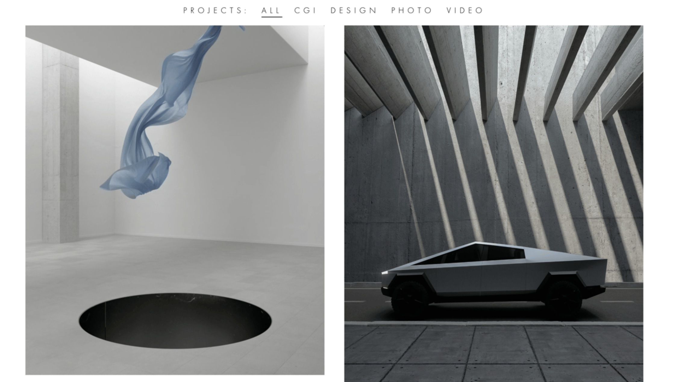
24. Antidote

Antidote is a creative agency that helps brands grow and expand. The home page features a rotating set of animated images that shine with quality.
The typography and white space surrounding text and images make reading through the site a breeze. The CTAs are easy to spot and no unnecessary image or elements fill the page, making this part of our minimalist web design examples list.
25. Takt Project
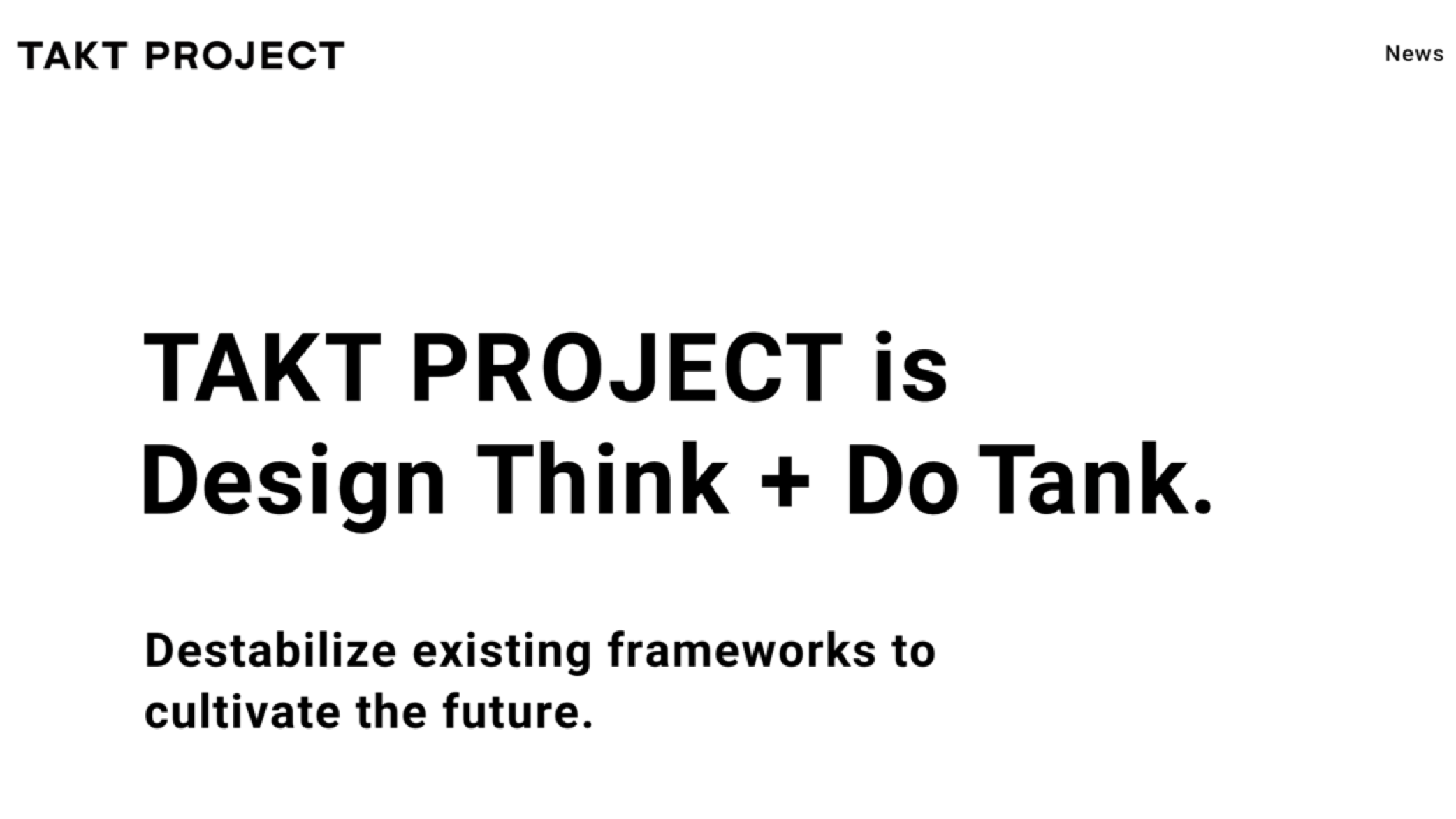
Takt Project keeps things nice and simple with its color choice and focuses on past projects. Select images are the focal point for your eyes as you scroll down.
The website employs lazy loading when showing the stunning images on the site. Ample empty space makes it easy to read through the copy and focus on the images on the site.
Minimalist web designs FAQs
Now that you’ve seen excellent examples of minimalist web designs, let’s go through some FAQs:
What is a minimalist web design?
A minimalist web design is a strategy that focuses on simple and functional design.
This design approach removes unnecessary elements from a web page with the goal of providing a clean and frictionless user experience to site visitors.
What are the elements of a good minimalist web design?
The elements of a minimalist web design are:
- White space
- High-quality images
- Typography
- Visual hierarchy
- Color palettes
Let’s dive into each one:
White space
Also known as negative space, white space refers to the empty space on a page. It improves the user experience by making your copy readable and enabling users to focus on other important visual elements on the page.
High-quality images
A minimalist design strategy uses only the necessary, high-quality images. These images make conveying your messages to your site visitors more impactful.
Typography
Typography refers to the tactic of carefully selecting a type’s font, size, color, alignment, and more. The goal? To create a visually appealing interface for users.
Visual hierarchy
Visual hierarchy is the arrangement of your page’s visual elements according to their importance. It makes your pages intuitive for your site users.
Color palettes
Color palettes enhance your site’s visual hierarchy. They make your overall site’s design coherent. While minimalist designs typically have white, black, and neutral colors as palettes, brands can also use other muted colors and monochromatic palettes.
What are minimalist web design principles?
Here are minimalist web design principles you can employ:
- Use white space: Minimalist web design employs white space to lead your site users to focus on the page content.
- Employ monochromatic color palettes: Monochromatic color palettes are typically used for minimalist web design. Just make sure your colors have enough contrast to make your website accessible for users with poor vision.
- Use accent colors sparingly: Limit the use of your bright accent colors. Use them for important CTAs to draw your site user’s attention.
- Make the user interface intuitive: Organize your visual elements and content to make it easy for your users to navigate your site and find what they’re looking for.
Employ a minimalist website with WebFX
Clean, simple website designs bring the most important features to the forefront that may be better for the user to focus on. Minimal websites load faster, look sharper, and are easier to navigate. If you want your website to have the most impact, you must prioritize design.
WebFX is here to help if you don’t have the time or resources to dedicate to web design in-house. We are a leader in full-service digital marketing and the best Baltimore web design agency. We make it easy to get your dream website while encouraging more traffic, conversions, and revenue.
Plus, we have offices all around the globe! For example, we offer London web design solutions, along with offering web design services in Harrisburg, Fort Myers, Ann Arbor, New York City, and more!
Contact us online or call us at 888-601-5359 to speak to a strategist about our web design services!
-
 Trevin serves as the VP of Marketing at WebFX. He has worked on over 450 marketing campaigns and has been building websites for over 25 years. His work has been featured by Search Engine Land, USA Today, Fast Company and Inc.
 -

WebFX is a full-service marketing agency with 1,100+ client reviews and a 4.9-star rating on Clutch! Find out how our expert team and revenue-accelerating tech can drive results for you! Learn more
Make estimating web design costs easy
Website design costs can be tricky to nail down. Get an instant estimate for a custom web design with our free website design cost calculator!
Try Our Free Web Design Cost Calculator
Table of Contents
- 25 Minimalist Web Design Examples
- 1. McChill
- 2. La La Land Kind Cafe
- 3. Zero
- 4. Mogutable
- 5. Velvethammer
- 6. Oishii
- 7. Brooklyn Candle Studio
- 8. TrueHarvest Farms
- 9. Ramotion
- 10. Kirkland & Ellis
- 11. ET Studio
- 12. Monograph
- 13. Maibec
- 14. Aesop
- 15. Studio Rotate
- 16. Pocket Knife
- 17. Good Books
- 18. Ignant
- 19. Coursera
- 20. Tous Le Jours
- 21. Symbolset
- 22. Andluca
- 23. Tatiana by Kwame Onwuachi
- 24 Antidote
- 25. Takt Project
- Minimalist Web Designs FAQs
- Employ a Minimalist Website with WebFX
- What is a Minimalist Web Design?
- What Are the Elements of a Good Minimalist Web Design?
- What Are Minimalist Web Design Principles?
Share this article


Web Design Calculator
Use our free tool to get a free, instant quote in under 60 seconds.
View Web Design Calculator
Make estimating web design costs easy
Website design costs can be tricky to nail down. Get an instant estimate for a custom web design with our free website design cost calculator!
Try Our Free Web Design Cost Calculator