When creating a design, it’s a good idea to prioritize key elements in the visual space by giving them heavier visual weights. For example, things you might consider giving heavier visual weights to — so that they’re more easily seen by the viewer — are call-to-action buttons in a web design, or the subject of a photograph. I’ll talk about a few tricks for increasing the visual weight of an object.
1. Give It a Different Color
When the color-contrast between an object and its surroundings (including its background) is high, the more able it is to garner our attention.  In the example above, notice how, even though the size, shape and margins of the stars are identical, the red star is able to get your attention simply because of how distinctive its color is compared to other elements in the composition.
2. Move It Away from Other Objects
One easy trick for increasing the visual weight of an object is distancing it from other objects. Adding plenty of negative space around the object separates it from other objects, which in turn makes the object stand out. 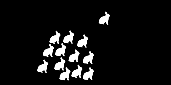 In the example above, look at how our eyes interpret the composition as two groups of rabbits: A big group of 12 rabbits and a small group consisting of only one rabbit.
By being farther away from the others, the estranged rabbit is able to command our attention more than any other rabbit in the composition.
3. Make It Look Different
When things look alike, it’s naturally hard for us to differentiate them. So, quite simply, we can make the visual weight of an object heavier by making it look different from other objects. 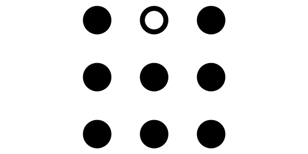 Even a slight change in the style properties of an object can heavily influence its visual weight if objects in the composition look similar.
In the above example, notice how the circle at the center of the first row is able to get our eyes’ attention compared to the other circles.
4. Point to It
A simple trick for increasing the visual weight of something is to direct the viewer’s eyes to it using visual cues such as arrows. 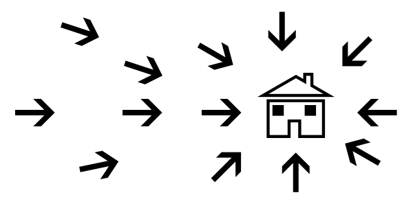 In the above example, check out how the visual weight of the house is increased because it’s surrounded by arrows that point to its location. No matter where our attention goes, we’re redirected to look at the house because of the arrows.
5. Make It Look Visually Complex
An ornate object attracts our eyes more when it’s set among simple and unadorned objects. We can make the appearance of an object complex by giving it textures, drop shadows, changing its shape, adding more color to it, and so forth. 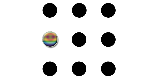 In the example above, the multi-colored circle has the heaviest visual weight because the surrounding objects are styled plainly.
6. Make It Bigger
Making an object larger than the other objects around it will increase its visual weight. It’s a reasonable proposition: The more visual space an object takes up, the more visible it is. 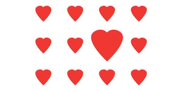 In the example above, notice how our eyes are quickly drawn to the biggest heart .
The only thing different with it is its size. Visual weight is a simple but incredibly powerful design tool for strategically arranging elements so that more important elements are readily seen by our viewers. What tricks do you use to increase the visual weight of an object? Share your advice in the comments.
-
 Trevin serves as the VP of Marketing at WebFX. He has worked on over 450 marketing campaigns and has been building websites for over 25 years. His work has been featured by Search Engine Land, USA Today, Fast Company and Inc.
 -

WebFX is a full-service marketing agency with 1,100+ client reviews and a 4.9-star rating on Clutch! Find out how our expert team and revenue-accelerating tech can drive results for you! Learn more
Make estimating web design costs easy
Website design costs can be tricky to nail down. Get an instant estimate for a custom web design with our free website design cost calculator!
Try Our Free Web Design Cost Calculator
Share this article


Web Design Calculator
Use our free tool to get a free, instant quote in under 60 seconds.
View Web Design Calculator
Make estimating web design costs easy
Website design costs can be tricky to nail down. Get an instant estimate for a custom web design with our free website design cost calculator!
Try Our Free Web Design Cost Calculator