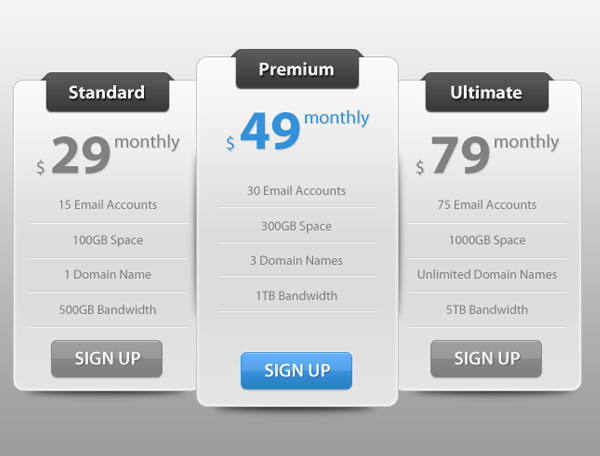

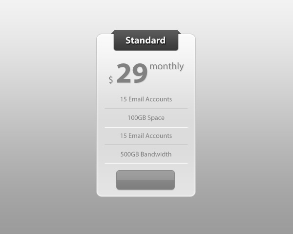
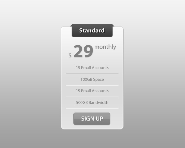
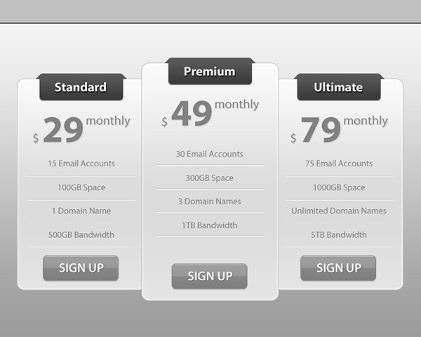
Preview
Click on the image to see it in full scale.
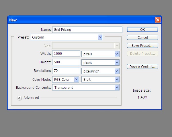
Step 1: Create a New Photoshop Document
Go to File > New, set your options as shown below and hit OK. Note that Background Contents option is set to Transparent, which will automatically create a transparent layer for us that is named “Layer 1” by default.
Step 2: Styling the Background
Let us create a slick background that will complement our pricing table. Use the Paint Bucket Tool (G) to fill the transparent “Layer 1” layer with any color you want.
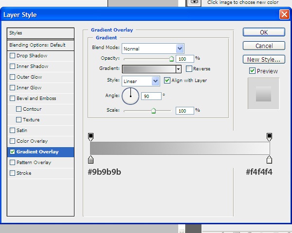
Then double-click the layer in the Layers Panel to open the Layer Style dialog window.
Add a smooth dark-gray to light-gray vertical gradient overlay.
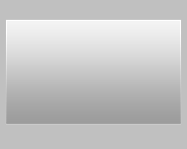
Here is our background now:
Step 3: Building the Middle Price Column
We’re going to build 3 price columns in total, and the middle one will be a little bit bigger than the other two in order to suggest the best plan for the user to pick. This is a popular design pattern for pricing tables where the suggested pricing plan is more distinctive than the other plans.
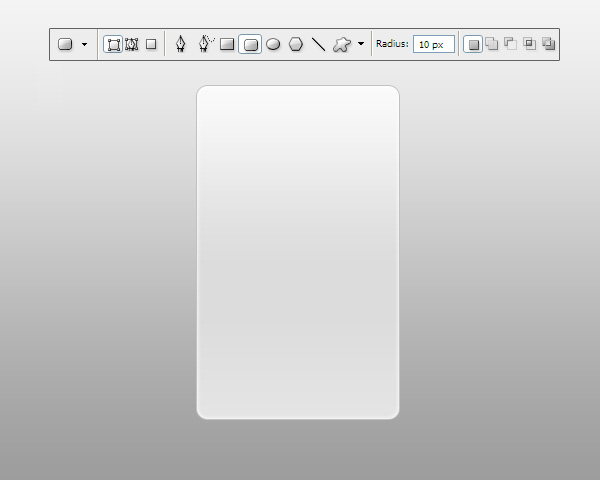
Select the Rounded Rectangle Tool (U), make sure that you are in Shape Layers mode (look at the Options Bar to double-check) and, with a Radius of 10px, draw a rectangle of size 200x330px.
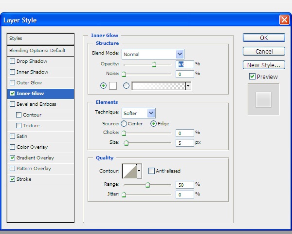
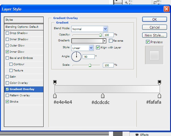
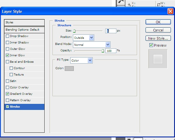
Double-click the rounded rectangle layer in the Layers Panel to open up the Layer Style dialog window. Give the rounded rectangle an Inner Glow, a Gradient Overlay, and a Stroke.
Inner Glow
Gradient Overlay
Stroke
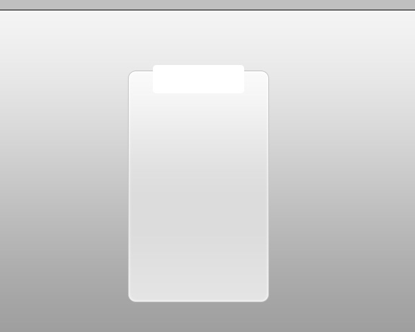
The result of the layer style is as follows:
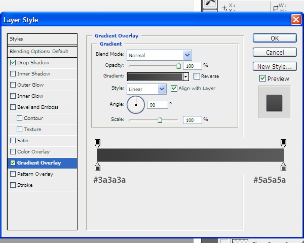
We’re now going to create a small rounded rectangle for the pricing plan name, which will become a wraparound 3D ribbon (another popular web design trend).
At the top of the price column, create a small rounded rectangle with Radius at 5px and dimensions of 130x40px using the Rounded Rectangle Tool.
Give the small rectangle a Drop Shadow and a Gradient Overlay.
Drop Shadow
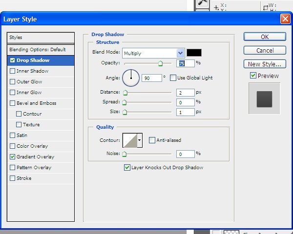
Gradient Overlay

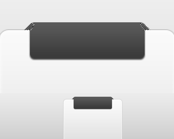
Use the Pen Tool (P) to draw small diagonal flaps on both sides of the small rounded rectangle (as shown below).
This will make it appear as if it’s wrapping around the price column.
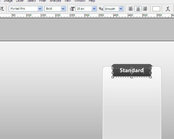
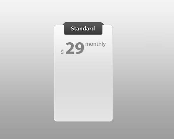
Choose the Horizontal Type Tool (T) and — with a font size of 20px, white as the text color, and a font of your choosing — write the plan’s name (in this case, the plan is called “Standard”). I used Myriad Pro as the font, but you can use any font you want.
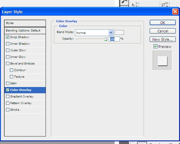
Give the text layer a nice, smooth drop shadow and gray color overlay.
Drop Shadow
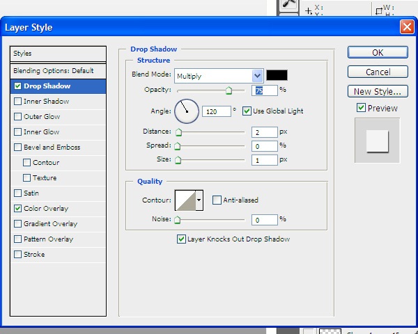
Color Overlay
Next, add the price details (as shown below), just under the plan name. It’s a good idea to use the same font for all the text, just style them differently.
Give the text a gray color overlay and a nice drop shadow.
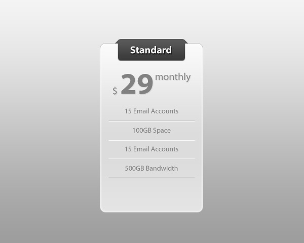
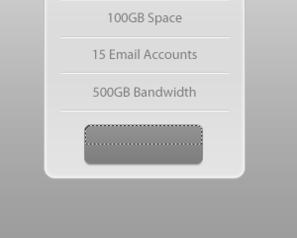
Now, under the price, we’ll design a list of features included in the “Standard” plan.
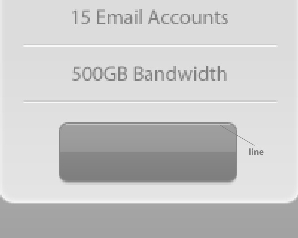
Under each list item, draw 2 lines with the height of 1px. Make the first line darker than the background and the other line lighter than the background, which will create a nice inset effect (a popular technique for borders and dividers).
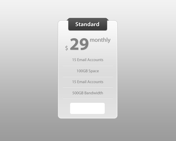
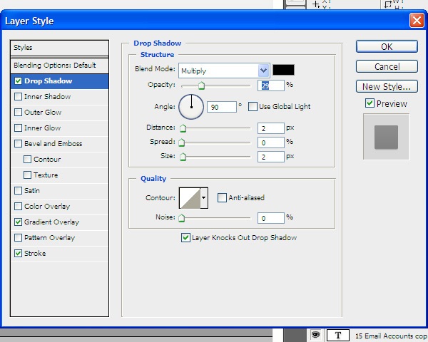
Next, let us create a modern and sleek web button. Use the Rounded Rectangle Tool (U) with Radius at 5px to make a rectangle sized at 100x38px at the bottom of the pricing column.
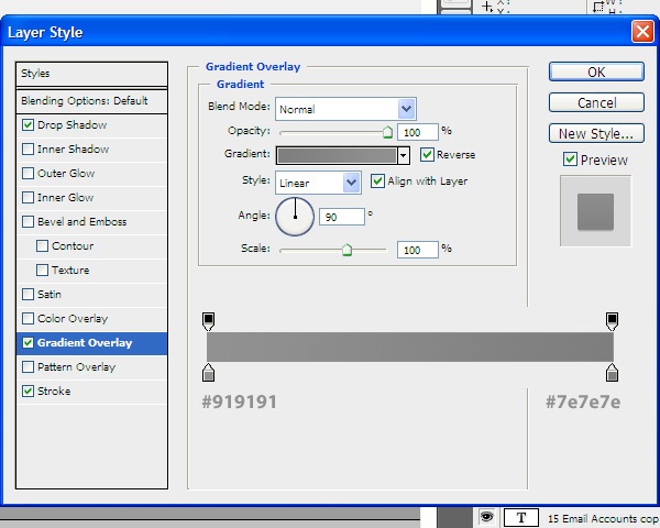
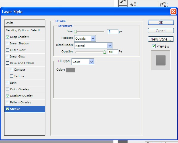
Give the button a Drop Shadow, a Gradient Overlay and a Stroke.
Drop Shadow
Gradient Overlay
Stroke
To make the button glossy, we have to give it a glassy reflection at the top.
I’m going to show you a simple technique for this that you can use in many graphic design situations.
First, Ctrl-click/Cmd-click on the thumbnail of the button layer in the Layers Panel to load a selection around it.
Now, select the Rectangular Marquee Tool (M). In the Options Bar, choose the Intersect with Selection mode. Draw a selection at the top half of the current selection, which will reduce your selection so that only the top half of the button is selected.
Create a new layer and, with the Paint Bucket Tool (G), fill the selection with white.
Reduce the Opacity of the new layer to 10%.
We will now add a top stroke on the web button. Create a new layer for the top stroke. Zoom in closely to see your work easier.
Draw a light gray line as shown below.
Use the Horizontal Type Tool (T) to add some text like “Sign Up” or “Join Us.” I used all caps and styled the text with a dark drop shadow.
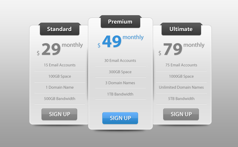
We are now finished with one of our price columns.
Step 3: Create the Other Price Columns
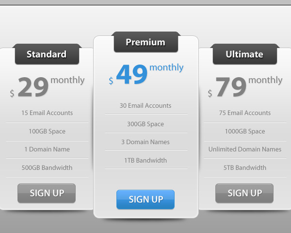
Now that we’ve created a price column, we can simply duplicate it and make modifications on the duplicates.
First, in the Layers Panel, select all the layers except the background layer and put them into a layer group (Layer > Group Layers).
Then duplicate the layer group 2 times and arrange them side by side (as shown below). Modify the details of the new columns so they are different from each other.
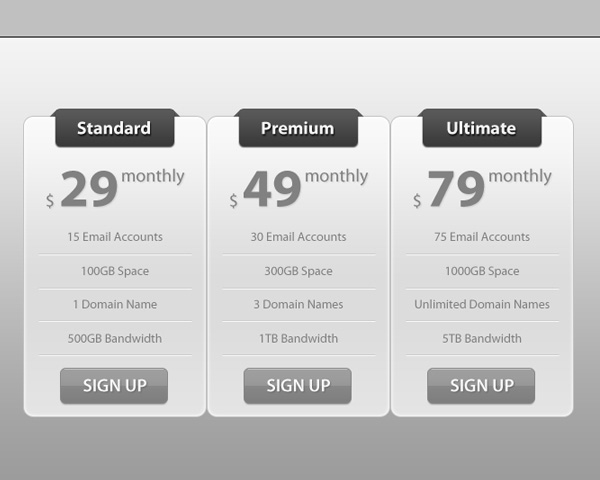
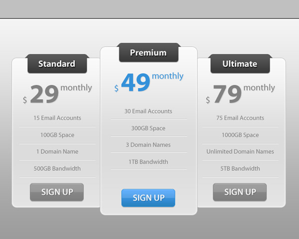
Step 4: Enlarge the Middle Price Column
To make the middle column stand out, click on its layer group in the Layers Panel to make it the active layer and then use Free Transform (Ctrl/Cmd + T) to scale it up. Make sure the middle column’s layer group is on top of the other layer groups.
To make the box more visible, modify the gradient overlay layer effect of the button and the price with any color you want.
I used blue.
Step 5: Final Touches
I’m going to show you how to add some nice drop shadows under the price columns. Select the Ellipse Tool (U) and draw a black, short and wide ellipse shape as shown below:
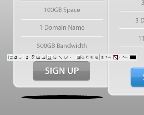
To soften the shape, use Filter > Blur > Gaussian Blur. 4px Radius should be enough.
Place the shadow’s layer just above the background layer.
Duplicate the shape twice so that you have 3 drop shadows for each of the price columns. Position the shapes under each column.
Tutorial Summary
We’ve just reached the end of the tutorial. I hope you enjoyed it and if you have any questions, just drop us a comment below!
We covered many easy and popular web design techniques such as creating slick web buttons, creating wraparound banners (for the title of the price plans), and more.
Download Source Files
- modern_sleek_pricingtable (ZIP, 0.12 MB)
-
 Trevin serves as the VP of Marketing at WebFX. He has worked on over 450 marketing campaigns and has been building websites for over 25 years. His work has been featured by Search Engine Land, USA Today, Fast Company and Inc.
 -

WebFX is a full-service marketing agency with 1,100+ client reviews and a 4.9-star rating on Clutch! Find out how our expert team and revenue-accelerating tech can drive results for you! Learn more
Make estimating web design costs easy
Website design costs can be tricky to nail down. Get an instant estimate for a custom web design with our free website design cost calculator!
Try Our Free Web Design Cost Calculator
Share this article


Web Design Calculator
Use our free tool to get a free, instant quote in under 60 seconds.
View Web Design Calculator
Make estimating web design costs easy
Website design costs can be tricky to nail down. Get an instant estimate for a custom web design with our free website design cost calculator!
Try Our Free Web Design Cost Calculator