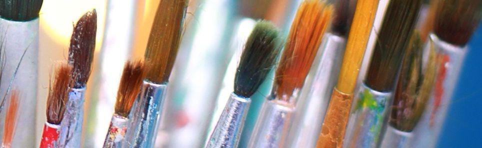
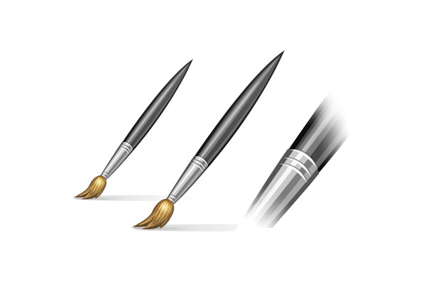
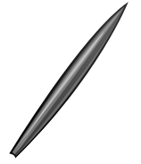
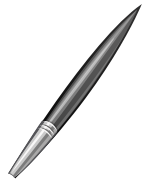
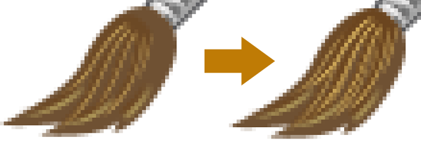
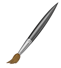
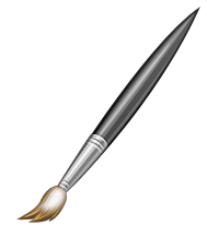
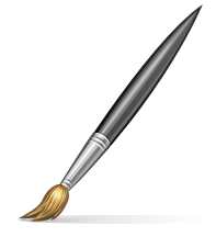
Preview
Step 1: Set Up the Canvas
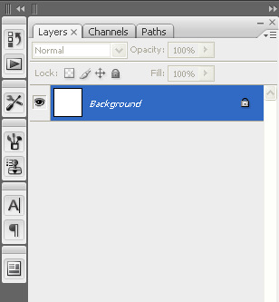
One thing that is always needed, of course, is making a new Photoshop document by choosing File > New or pressing the Ctrl/Cmd + N shortcut. We will use a 256x256px canvas, which is a popular dimension for icons. 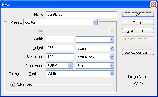 You should also make sure that the Background Contents option is set to White so that we will have a default white Background layer; it will make it easier to see our work and you can always change the color later or delete it so that you have a transparent background.
Step 2: Draw the Handle of the Brush
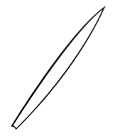
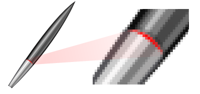
Use the Pen Tool (P) to make a shape in the center of the canvas that resembles the image below. Make sure to use the Shape Layers option (found in the Options Bar) for the Pen Tool so that the shape you create becomes a shape layer. 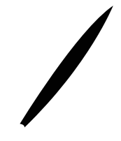 Right-click on the shape layer in the Layers Panel and then choose Layer Properties.
![]() In the Layer Properties dialog window, name our shape layer as “base” to keep our PSD organized.
In the Layer Properties dialog window, name our shape layer as “base” to keep our PSD organized. 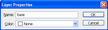
Step 3: Style the Handle of the Brush
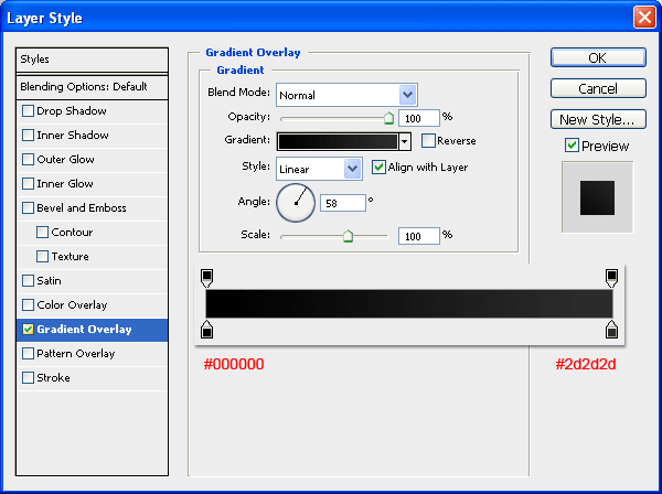
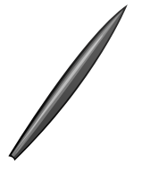
Let us give the “base” shape layer (the handle of our brush icon) a Gradient Overlay effect by right-clicking on the layer in the Layers Panel and then choosing Blending Options from the contextual menu that appears. Have the color gradient go from black (#000000) to a dark gray (#2d2d2d).
 The gradient overlay will result in a nice, subtle gradient surface for our handle.
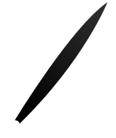
Step 4: Draw the Inside of the Brush Handle
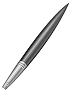
We will now stylize our brush’s handle. Use the Pen Tool (P) to draw a white shape inside our handle.
 Decrease the new shape layer’s Opacity to 24%.
  By decreasing the opacity, we let a bit of the black-dark gray gradient overlay from the “base” shape layer shine through.
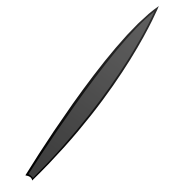
Step 5: Draw Light Reflections on the Brush Handle
We will give our handle a light reflection to make its surface more interesting.
Create a new white shape using the Pen Tool again; you can name this shape layer as “light1”. 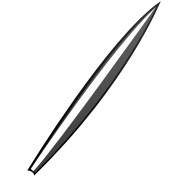 Lower the Opacity of the “light1” shape layer to around 28%.
 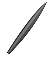 Let’s continue on with the light reflections by drawing a very thin white shape (name the shape’s layer as “light2”) as shown below (highlighted in red).
 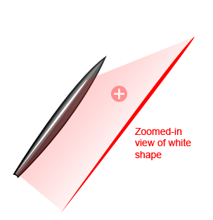 Once you’ve drawn the shape, lower its layer’s Opacity to 45%.
 Similarly, you will create a new thin shape (“light 3”) with the Pen Tool, just over the previous two shape layers as shown in red below.
 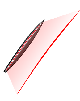 Give this new shape an off-white (#f2f2f2) Color Overlay.
  Reduce the layer’s Opacity to 20%.
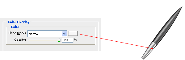
 We’ll need to create yet another light reflection highlight (“light 4”). The shape will be towards the lower edge of the brush handle (as shown in red).
 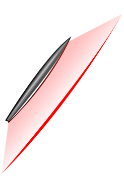 Lower the layer’s Opacity to 20%.
Step 6: Organizing Our Work in a Layer Group
Before we go any further, it’s best to take a few moments to organize our layers, as we seem to be making a lot of them. Create a new group icon (it looks like a folder) that is found at the bottom of the Layers Panel. By default, the layer group’s name will be “Group 1”. ![]() Rename the new layer group to something more accurate, such as “wood” or “handle”. Except for the Background layer, drag all of the current layers inside this group.
Rename the new layer group to something more accurate, such as “wood” or “handle”. Except for the Background layer, drag all of the current layers inside this group. 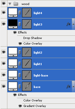 You can now collapse the layer group by clicking on the small gray triangle just beside the small folder thumbnail.
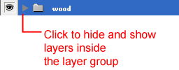
Step 7: Draw the Metal Grip Base Shape
Most paintbrushes will have a sort of metallic grip that serves the other function of holding together the brush’s bristles.
Draw a new shape with the Pen Tool (name this layer “metal-base”) just above the “wood” layer group. 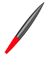
Step 8: Style the Metal Grip Base Shape
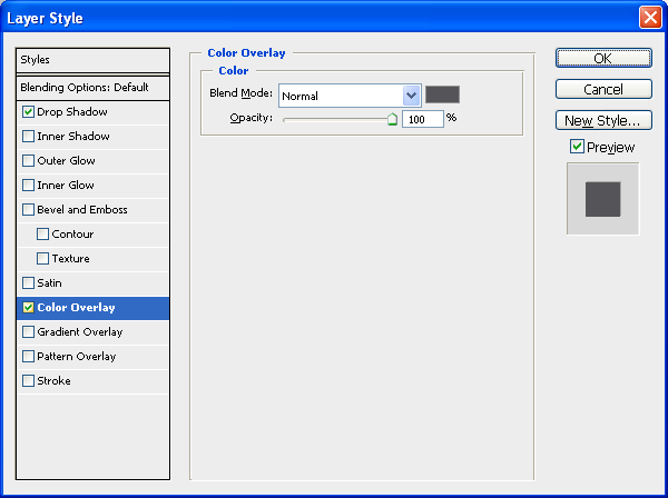
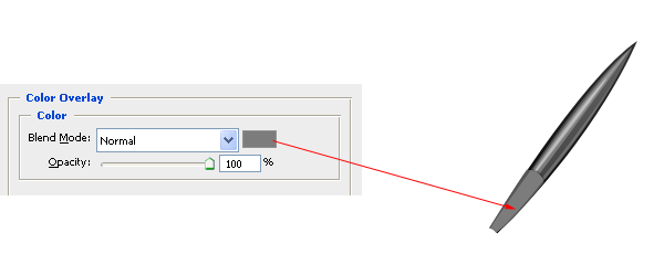
Let us give our metallic grip two layer effects: a Color Overlay and a Drop Shadow.
Color Overlay
Use a gray (#555559) color overlay.
Drop Shadow
The drop shadow’s color should be black (#000000). 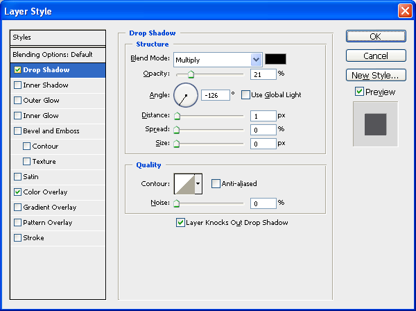 Our metallic grip should now look like the following image.
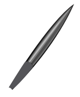
Step 9: Add Light Reflections on the Metal Grip
Like the brush handle, we need to add some light reflections and surface textures onto our metal grip to keep our icon’s lighting consistent.
Draw a new shape (name the layer as “light5”) with the Pen Tool that covers the inside of the metal grip. It can be any color because we will use a layer effect next.  Give the “light5” shape layer a gray (#7c7c7c) Color Overlay layer style.
 Continuing on with light reflections, again use the Pen Tool to draw a new shape towards the left side of the metal brush (we can call this one “light6” to keep our layer naming convention consistent).
 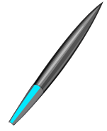 Give this new shape a lighter gray (#cacaca) Color Overlay layer style.
 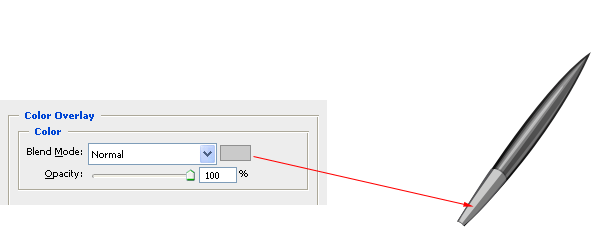 We are going to continue creating new light reflection shapes using the same method.
Below is “light7”. 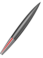 Give the “light7” layer an off-white (#f8f7f7) Color Overlay.
 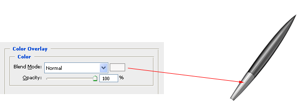 This is the final light reflection shading we will make (“light8”).
 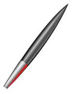 Use the same off-white color (#f8f7f7) for the “light8” Color Overlay layer style.
 Additionally, lower the “light8” layer Opacity to about 35%.
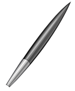
Step 10: Create Grooves on the Metal Grip
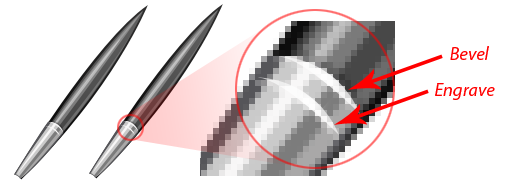
To give our paintbrush an added bit of realism, we will create strips of grooves on the metal grip. Start by making a tiny new shape with the Pen Tool (P), as shown in red below.
 Give the rim a Color Overlay using an off-white/light gray color (#f8f7f7).
 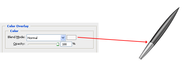 Let’s make more grooves by duplicating the above shape. Use the Move Tool (V) to move it a few pixels away from the original shape.
 Give the duplicated shape a Drop Shadow to create the effect that it’s impressed into the metallic surface; use a dark gray color for the drop shadow (#656464).
 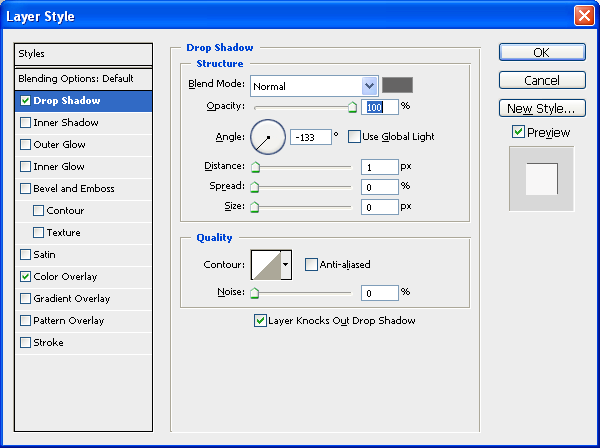 Your metal grip should now look like the following image.
  Make another groove using the same process as above.
 Create grooves towards the bristles as well.
 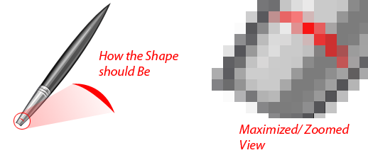 Use a Color Overlay and a Drop Shadow for the lower grooves as well, but this time, use different colors; the Color Overlay color should be off-white (#f8f7f7) and the Drop Shadow color should be gray (#656464).
 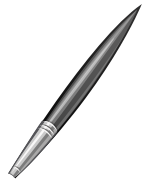 Duplicate the shape to make one more groove.
 Before we move on to the bristles, add a new layer group (you can call it “metal”) and place all layers related to the metal grip inside of it.
Step 11: Creating the Bristles Base Shape
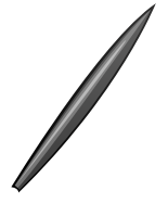
Use the Pen Tool (P) to draw the base shape for the bristles (shown in red). 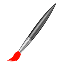
Step 12: Color the Bristles Base Shape
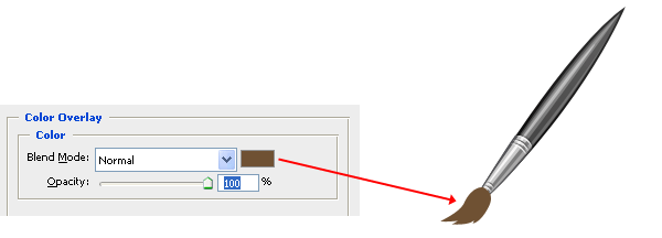
Use a Color Overlay to set the shape’s color to a brown (#6f5133).
Step 13: Create Strands on the Bristles Base Shape
We need to give our shape some definitions so that it looks like hairs. Create a new shape (named “strands1”) using the Pen Tool (P) above the base shape layer. 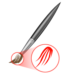 Give the shape two layer effects: a Color Overlay and a Drop Shadow.
Color Overlay
Use a brown color that is slightly lighter than the base shape’s color for the overlay (#6b451f). 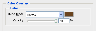
Drop Shadow
Use a muted yellow (#efc86a) for the color of the drop shadow. 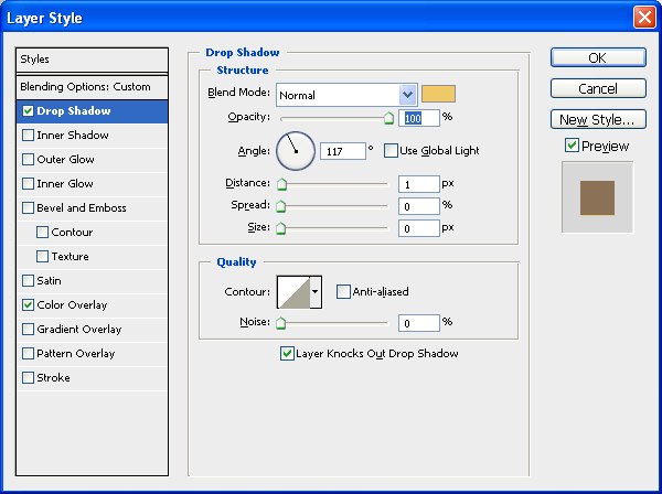 Our brush’s tip should now look like the following image.
 Create more shapes with the Pen Tool (P) to enhance the definitions of our bristles.
 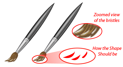 Apply the same Color Overlay and Drop Shadow layer style, as well as reduce the Opacity of the shape layer to 70%.
  Duplicate the “strands1” shape layer and move it just near the top.
Step 14: Highlight the Bristle Tips
Make the two shapes as shown below, towards the end of the bristles.  If you have created the shape using the Pen Tool, then these two shapes will be made in different layers by default. Select both of layers in the Layers Panel, right-click and then choose Convert to Smart Object.
Rename this smart object as “light1-tint”. Then select the Blur Tool from the Tools Panel. Once you try to use the Blur Tool, it will show a dialog window like this: 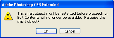 Just click OK. And then start using the Blur Tool very gently along the rightmost side of the visible white shape in the “light1-tint” layer.
 Adjust the Blend Mode of the layer to Overlay and Opacity to 70%.
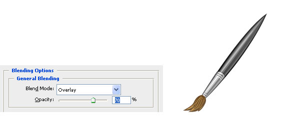
Step 15: Create Subtle Bristle Shadows
Create thin shapes along the bottom of the bristles like the blue-green one shown below. 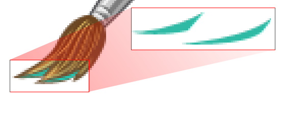 You may rename these shapes as “shadow1” and “shadow2” respectively.
Use a Color Overlay to make their color brown (#4c3722). 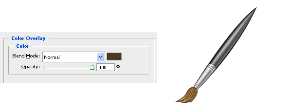 The above shadow shapes have brought about the following very subtle transformation.
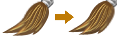
Step 16: Paint a Bristle Lighting Effect
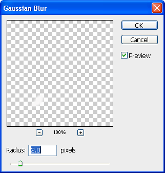
Now create a new white-colored shape on top of the bristle (named “main-light”) to represent a subtle light reflection on the bristle.
 Now go to Filter > Blur > Gaussian Blur to soften the white shape. If a window like this pops up:
 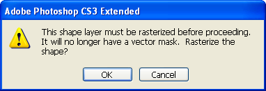 Just click OK to rasterize it. Set the Radius to 2px.
 Then set the Blend Mode to Overlay and reduce the Opacity of the layer to 69%.
 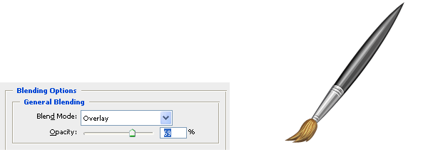 Duplicate the blurred layer. Go to Edit > Free Transform (Ctrl/Cmd + T) and scale down the duplicated layer a bit, resulting in a stacked lighting effect with varying translucence.
 Duplicate the layer again to make an even more pronounced light effect.
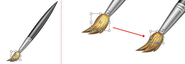
 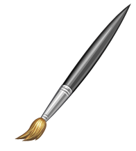 Organization time: Create a new layer group (name it “bristles”) and drag all the bristle-related groups inside of it.
Step 17: Adding a Shadow to the Brush
Finally, we need to add a shadow to make our piece look more realistic and interesting.
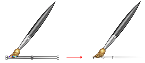
Choose the Background layer in the Layers Panel and then create a new layer above it (Ctrl/Cmd + Shift + N); you can call this new layer “shadow-main”. Pick the Elliptical Marquee Tool from the Tools Panel. 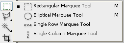 Make a short and wide elliptical selection at the bottom of our paint brush icon.
  Now get the Gradient Tool (G) and set its options in the Options Bar such that the gradient is from black to transparent and the style is a Linear Gradient.
 Drag the Gradient Tool from left to right.
 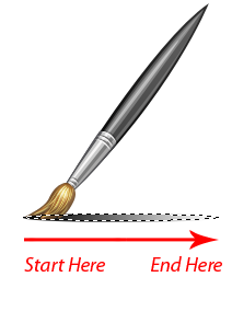 Reduce the layer’s Opacity to 15%.
 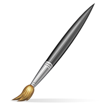 Next, duplicate the “shadow-main” layer and use Free Transform (Ctrl/Cmd + T) to scale it down.
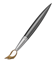
Tutorial Summary
This Photoshop tutorial showed you how to make a beautiful paintbrush icon from scratch. We used shape layers, a bit of the Pen Tool, and some layer styles. The goal of this tutorial was to create an icon with realistic characteristics, such as light effects, highlights and shadows.
We spent some time detailing the brush tip, which just goes to show how important it is to mind the details. 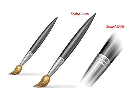
Download Source Files
- paint_brush_icon (ZIP, 0.06MB)
-
 Trevin serves as the VP of Marketing at WebFX. He has worked on over 450 marketing campaigns and has been building websites for over 25 years. His work has been featured by Search Engine Land, USA Today, Fast Company and Inc.
 -

WebFX is a full-service marketing agency with 1,100+ client reviews and a 4.9-star rating on Clutch! Find out how our expert team and revenue-accelerating tech can drive results for you! Learn more
Make estimating web design costs easy
Website design costs can be tricky to nail down. Get an instant estimate for a custom web design with our free website design cost calculator!
Try Our Free Web Design Cost Calculator
Table of Contents
- Preview
- Step 1: Set Up the Canvas
- Step 2: Draw the Handle of the Brush
- Step 3: Style the Handle of the Brush
- Step 4: Draw the Inside of the Brush Handle
- Step 5: Draw Light Reflections on the Brush Handle
- Step 6: Organizing Our Work in a Layer Group
- Step 7: Draw the Metal Grip Base Shape
- Step 8: Style the Metal Grip Base Shape
- Step 9: Add Light Reflections on the Metal Grip
- Step 10: Create Grooves on the Metal Grip
- Step 11: Creating the Bristles Base Shape
- Step 12: Color the Bristles Base Shape
- Step 13: Create Strands on the Bristles Base Shape
- Step 14: Highlight the Bristle Tips
- Step 15: Create Subtle Bristle Shadows
- Step 16: Paint a Bristle Lighting Effect
- Step 17: Adding a Shadow to the Brush
- Tutorial Summary
- Download Source Files
Share this article


Web Design Calculator
Use our free tool to get a free, instant quote in under 60 seconds.
View Web Design Calculator
Make estimating web design costs easy
Website design costs can be tricky to nail down. Get an instant estimate for a custom web design with our free website design cost calculator!
Try Our Free Web Design Cost Calculator